
Specifications
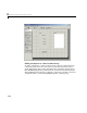
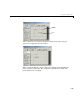

Using the Layout Editor
3-11
After selecting the components for your GUI and placing them in the layout
area, you need to set their properties and program their callbacks. The
following sections describe how to do this:
• “Setting Component Properties — The Property Inspector” on page 3-40
• “Programming Callbacks for GUI Components” on page 4-8
Push Button
Push buttons generate an action when clicked. For example, an OK button
might close a dialog box and apply settings. When you click a push button, it
appears depressed; when you release the mouse, the button appears raised and
its callback executes.
Toggle Button
Toggle buttons generate an action and indicate whether they are turned on or
off. When you click a toggle button, it appears depressed, showing that it is on.
When you release the mouse button, the toggle button’s callback executes.
However, unlike a push button, the toggle button remains depressed until you
click the toggle button a second time. When you do so, the button returns to the
raised state, showing that it is off, and again executes its callback.
Radio Button
Radio buttons are similar to check boxes, but are typically mutually exclusive
within a group of related radio buttons. That is, you can select only one button
at any given time. To activate a radio button, click the mouse button on the
object. The display indicates the state of the button.
Check Box
Check boxes generate an action when checked and indicate their state as
checked or not checked. Check boxes are useful when providing the user with
a number of independent choices that set a mode, for example, displaying a
toolbar or generating callback function prototypes.
Edit Text
Edit text controls are fields that enable users to enter or modify text strings.
Use edit text when you want text as input. The
String property contains the
text entered by the user. The callback executes when you press
Enter for a