
Specifications


3 GUIDE Layout Tools
3-12
All of the align options (vertical top, center, bottom and horizontal left, center,
right) place the selected components with respect to corresponding edge (or
center) of this bounding box.
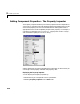
Distribute Options
Distributing components adds equal space between all components in the
selected group. The distribute options operate in two different modes:
•Equally space selected components within the bounding box (default)
•Space selected components to a specified value in pixels (check
Set spacing
and specify a pixel value)
Both modes enable you to specify how the spacing is measured, as indicated by
the button labels on the alignment tool. These options include spacing
measured with respect to the following edges:
•Vertical – inner, top, center, and bottom
•Horizontal – inner, left, center, and right
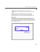
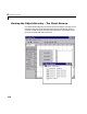
Grids and Rulers
The layout area displays a grid and rulers to facilitate component layout. Grid
lines are spaced at 50-pixel intervals by default and you can select from a
number of other values ranging from 10 to 200 pixels. You can optionally
enable snap-to-grid, which causes any object that is moved or resized to within
9 pixels of a grid line to jump to that line. Snap-to-grid works with or without
a visible grid.