
User`s guide

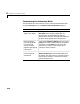
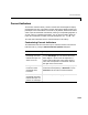
Table Of Contents
- Getting Started
- Using Instrumentation in a Model
- Categories of ActiveX Controls
- Placing ActiveX Controls in a Different Window
- Library Reference
- Index
Percent Indicators
3-21
Percent Indicators
The Percent Indicators library contains controls that are designed to display
percentages and ratios. The Generic Percent and Simple Light Blue blocks are
probably the most useful blocks in this library. By default, these blocks reflect
scalar input values between 0 and 100 by coloring a corresponding segment of
a linear scale. By customizing the blocks, you can also have them display an
input value X between m and M as the percentage 100 * ((X - m) / (M - m)).
The next section describes how to customize blocks in this library.
Customizing Percent Indicators
The table below lists some common ways to customize a block in the Percent
Indicators library, using its
ActiveX Control Properties dialog box.
Task Description
Use a radial
percentage scale that
reflects the input as a
sector of a circle
On the
Misc. panel, set DisplayMode to Radial.
Use the
StartAngle value to indicate where the
sector begins; a value of zero corresponds to a
vertical radius above the circle’s center, while a
value of 90 corresponds to a horizontal radius to
the right of the circle’s center.
Change the direction
in which a radial
percentage scale
increases
On the
Misc. panel, use the Direction property to
reverse the scale’s polarity. If
Direction is set to
Forward, then the scale increases clockwise.
Use a linear
percentage scale that
reflects the input as a
portion of a rectangle
On the
Misc. panel, set DisplayMode to Linear.