
User`s guide
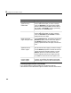

Table Of Contents
- Getting Started
- Using Instrumentation in a Model
- Categories of ActiveX Controls
- Placing ActiveX Controls in a Different Window
- Library Reference
- Index

3 Categories of ActiveX Controls
3-6
Buttons & Switches
The Buttons & Switches library contains two-state controls that change their
state when you click on them. The block output is
0 when the block’s state is
“off” and
-1 when the state is “on.” The blocks in this library differ in cosmetic
ways, such as the image(s) shown on the block and the changes in the block’s
appearance after you click on it. The next sections describe how to customize
buttons and switches, and how to change the output values from buttons and
switches.
Customizing Buttons and Switches
The table below lists some common ways to customize a block in the Buttons &
Switches library, using its
ActiveX Control Properties dialog box.
Task Description
Associate an image
with a state
Press the Picture button on the On or Off panel,
and select a graphics file. You cannot associate
both an image and text with a state.
Associate text with a
state
Use the
Caption field on the On or Off panel. The
X and Y values control the position of the text.
The
BackColor and ForeColor buttons control
the colors of the background and text,
respectively. You cannot associate both an image
and text with a state.
Associate a sound
with a state
On the
On or Off panel, check the Sound check
box and list a
.wav file in the Wave file field. You
can either type the name of the sound file or
browse for it using the
... button.
Make the button turn
off after being on for a
specified length of
time
Set the
OnTimer property in the General panel
to a nonzero value, measured in milliseconds.