
User`s guide

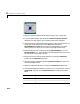
Table Of Contents
- Getting Started
- Using Instrumentation in a Model
- Categories of ActiveX Controls
- Placing ActiveX Controls in a Different Window
- Library Reference
- Index
Angular Gauges
3-3
Angular Gauges
The Angular Gauges library contains controls that reflect their input value
graphically along an arc of a circle. Blocks in the library differ from each other
in their numerical ranges and in their use of needles, numerical labels, text
captions, annular components, and tick marks.
The next section describes how to customize angular gauges by making
changes that are specific to the Angular Gauges library. For changes that apply
to multiple categories of blocks, see these sections:
•“Using Multiple Styles Within One Block” on page 2-4
•“Displaying Text on a Block” on page 2-8
•“Modifying the Displayed Range” on page 2-12
•“Modifying Multiple Tick Marks” on page 2-15
Customizing Angular Gauges
The table below lists some common customizations involving the ActiveX
Control Properties
dialog box that are specific to blocks in the Angular
Gauges library.
Task Description
Change the shape or
size of a needle
On the Needles panel, set NeedleID to the ID of
the needle you want to change (
0 if there is
exactly one needle). Then use the
Style property
to choose the shape, and the
Length and Width
properties to determine the length and thickness.
Label a needle by
displaying the
corresponding
number
On the
Digital panel, set NeedleID to the ID of
the needle you want to label and check the
Enabled check box.