
User`s guide

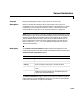
Table Of Contents
- Getting Started
- Using Instrumentation in a Model
- Categories of ActiveX Controls
- Placing ActiveX Controls in a Different Window
- Library Reference
- Index
LEDs
5-8
5LEDs
Purpose Display input value using one or more two-state graphical elements
Description Blocks in the LEDs library use graphical elements to imitate light-emitting
diodes (LEDs). Each block reflects its input value by setting one or more
graphical elements to an “on” or “off” state. By default, the number of LEDs in
the “on” state is the rounded value of the block’s input. If the rounded value is
nonpositive, then all LEDs are in the “off” state, while if the rounded value
exceeds the number of LEDs, then all LEDs are in the “on” state. To learn how
to use and customize blocks in this library, see “LEDs” on page 3-14.
Dialog Box The ActiveX Control Properties dialog box governs the appearance and
functionality of the ActiveX control itself. The table below lists the panels of the
ActiveX Control Properties dialog box.
The
Block Parameters dialog box governs the interaction between Simulink
and the ActiveX control embedded in the block. See “Summary of Dialog Box
Fields and Check Boxes” on page 3-29 for details.
Panel Purpose
Background
Configure the background and outline of the block
LEDs/General
Define the number, arrangement, and behavior of LEDs
on the block
Library
Refer to property settings as a named collection
Style
Define the appearance of LED graphical elements (The
LEDs/General panel uses the LEDStyleID property to
reference the styles defined here.)