
User`s guide

2 Importing, Viewing, and Preprocessing Data
2-6
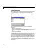
Viewing Data
The Curve Fitting Toolbox provides two ways to view imported data:
• Graphically in a scatter plot
• Numerically in a table
Viewing Data Graphically
After you import a data set, it is automatically displayed as a scatter plot in the
Curve Fitting Tool. The response data is plotted on the vertical axis and the
predictor data is plotted on the horizontal axis.
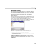
The scatter plot is a powerful tool because it allows you to view the entire data
set at once, and it can easily display a wide range of relationships between the
two variables. You should examine the data carefully to determine whether
preprocessing is required, or to deduce a reasonable fitting approach. For
example, it’s typically very easy to identify outliers in a scatter plot, and to
determine whether you should fit the data with a straight line, a periodic
function, a sum of Gaussians, and so on.
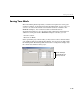
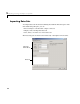
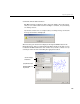
Enhancing the Graphical Display
The Curve Fitting Toolbox provides several tools for enhancing the graphical
display of a data set. These tools are available through the
Tools menu, the
GUI toolbar, and right-click menus.
You can zoom in, zoom out, display data and fit tips, and so on using the
Tools
menu and the GUI toolbar shown below.
Tools menu
GUI toolbar