
User manual
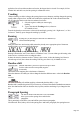

Table Of Contents
- Support
- More from MAGIX
- Welcome to MAGIX Xtreme Print Studio
- Short description
- Document handling
- Object Handling
- The Pen Tool
- Creating rectangles and squares
- Creating circles and ellipses
- Creating regular polygons (the Quickshape Tool)
- Color Handling
- Text Handling
- Printing
- Customizing
- Menus and Keyboard Shortcuts
- Introduction
- File menu
- Edit menu
- Undo (Standard control bar or Ctrl+Z)
- Redo (Standard control bar or Ctrl+Y)
- Cut (Edit control bar or Ctrl+X)
- Copy (Edit control bar or Ctrl+C)
- Paste (Edit control bar or Ctrl+V)
- Paste in place (Ctrl+Shift+V)
- Paste Attributes (Ctrl+Shift+A)
- Delete (Edit & Standard control bars or Delete)
- Select All (Ctrl+A)
- Clear Selection (Esc)
- Duplicate (Edit control bar or Ctrl+D)
- Clone (Ctrl+K)
- Arrange menu
- Utilities menu
- Window menu
- Help menu
- The help system

Justification or text alignment
Justification always applies to the complete line. Any selected region is ignored.
When using simple text the initial click position
on the page is taken as the origin for text justification.
Left
justification: Align the left-hand edge of the text to the initial click position.
Center
justification: Centers the text around the click position.
Right
justification: Align the right-hand edge of the text to the initial click position.
Full
justification: This only applies when text is along a curve or in a column and when there is at least one full
line of text to justify.
Subscript & superscript
Click the appropriate button on the InfoBar
.
Normal text
subscript
superscript
Line spacing
Line spacing allows you to change the space between two
lines (so affects vertical spacing).
Line spacing is measured in percentages (120%) or points (12pt). You can either type the line space
value in the text box or click the arrows to nudge the values.
A percentage setting has the benefit of scaling accordingly if you change your font size. If a percentage is
applied to a line of text with more than one font size, the largest font size is used. For example, if a line
contains 90% and 100% text, the line spacing is calculated on 100%.
Tracking
Whereas kerning (see below) changes the spacing between two characters, tracking changes the spacing
equally within a region of text. An EM is the width of the capital letter "M" in the current font and font
size. It is therefore relative to the font size and not a fixed value.
1.
Select the region to which you want to apply
tracking.
2.
Type a value into the Tracking text box (values are
in 1/1000ths of ems).
From the keyboard you can increase or decrease the tracking by pressing "Alt + Right arrow", or "Alt +
Left arrow". Each key press changes the tracking by 10/1000.
Kerning
Kerning lets you alter the space between two characters (so
affects horizontal spacing).
Most good fonts have auto-kerning which means they already move appropriate pairs of characters
together slightly, as you can see from this diagram:
Page 178