
MX
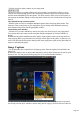
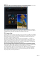
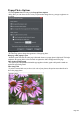
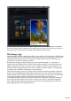

Table Of Contents
- Purchasing and unlocking Web Designer MX Premium
- Support
- What is new in Web Designer MX Premium? (v8)
- Introduction
- Getting Help
- Getting Started
- Program Layout
- Objects On The Page
- Object Based Web Design
- The Selector Tool
- Website Toolbar
- Creating a website
- Previewing Your Website
- Using Templates, Clipart & Widgets
- The Designs Gallery
- Website Colors
- Photos
- Text
- Selecting a page size
- Automatic page resizing
- Saving Your Work. Creating A Website
- Stretchy Objects
- Groups
- Repeating Objects
- Links, Buttons & Navigation Bars
- Displaying your own icons in browser tabs: favicons
- Drawing Tools
- Right-click menus
- Layers, Mouseover (Rollover) & Pop-ups
- Creating Buttons, Banners And Other Web Graphics
- Publishing Your Website
- Document handling
- Starting a new document
- Opening an existing document
- The Web Designer MX Premium window
- Opening a second window
- Changing the zoom value
- Sliding the document within the window
- Changing the page size
- Multiple pages in the document
- Saving the document
- Support folders
- Closing the document
- Automatic Backups
- On-screen grid
- Rulers
- View quality
- Galleries
- Undo and Redo
- Object Handling
- The Selector Tool
- Moving objects
- Removing objects from the document
- Duplicating and cloning
- Moving objects forward and backwards
- Rotating using the mouse
- Scaling (resizing) objects
- Flipping objects
- Stretching and squashing objects
- Skewing objects
- The Mold tool
- Snapping
- Guide Objects and Guidelines
- Summary of shortcuts on the numeric keypad
- Grouping and ungrouping objects
- Soft Groups
- Alignment
- Copying Styles: Paste Attributes
- Naming objects
- Repeating Objects
- Footers and objects that stretch with the page
- Drawing Lines and Shapes
- Drawing a line or shape
- The Freehand & Brush Tool
- Editing lines/shapes with the Freehand & Brush Tool
- The Straight Line & Arrow tool
- The Shape Editor tool
- Extending the line
- Finishing the line
- Adding a new point handle
- Selecting multiple point handles
- Deleting points
- Moving point handles—Shape Editor Tool
- Smoothing a line
- Constraining the line
- Changing curves
- Changing a straight line to a curve (and vice versa)
- Joining lines
- Splitting a shape
- Line Gallery
- Closing a shape
- Changing the line width (thickness)
- Shape Handling
- Color Handling
- The color line
- Applying fill & line colors by drag & drop
- Editing an object’s color
- The Color Editor
- Local colors and Theme colors
- Theme color schemes
- Creating your own color schemes
- Creating new named colors
- Editing named colors
- Normal colors, Tints, Shades and Linked colors
- Creating a Tint, Shade or Linked color
- Text Handling
- Introduction
- Terminology
- The Text Tool
- The Font Menu
- Simple text
- Text in a column
- Text areas
- Text along a curve
- Editing text
- Spell checker
- Find & Replace
- Synchronising Text using Soft Groups
- Tabs, Margins and Indents
- Repelling text objects
- Anchored Graphics
- Embedded Graphics
- Text Styles
- Applying text attributes
- Text links
- Text inside groups for websites
- Copying text appearances
- Copying/Pasting formatted text (RTF)
- Seeing fonts in use
- Document font embedding
- Website font embedding
- Browser text compatibility
- The Fill Tool
- Transparency
- Shadows
- Bevels
- Masks
- Web Properties Dialog
- Live Effects
- Photo Handling
- Introduction
- Photo Objects
- Photo Groups
- Importing Photos
- Zero-memory Copies
- The Bitmap Gallery
- Embedded JPEG files
- Blending & Merging photos
- Photo display quality
- Saving & Exporting Photos
- Photo Edit Attributes
- Editing the outline of Photos
- Cropping photos
- Cropping photos with a mask
- Cutting objects out of photos
- Screen capture utility
- Coloring photos
- Resize, rotate and position a photo within its frame
- Horizon Straighten
- Viewing a scaled photo at its full size
- Making a photo its full size
- Optimizing Photos and Bitmaps
- Converting objects or drawings to bitmaps
- Photo Documents
- Editing Photo Files
- The Photo Tools
- 3D Extrude Tool
- Navigation Bars
- Using template Navbars
- Navigation bar properties dialog
- Site navigation bar
- Buttons & Menus
- Updating your Navbar across all pages
- On canvas editing
- Changing the font on Navbar buttons
- Importing & pasting Navbars
- Creating your own Navigation Bars
- Button margins
- Advanced - Editing a Navbar button design
- Navbars with different first or last buttons
- Website Presentations
- The Presentation toolbar
- Creating a presentation
- Managing presentation steps
- Adding new presentation pages
- Creating Number and Bullet lists
- Deleting presentation pages
- Linking to next/previous step
- Applying transitions to presentation step links
- Applying presentation step transitions
- Applying presentation page transitions
- Advanced presentation information
- Hosting remote presentation sessions
- Website Widgets
- Page & Layer Gallery
- Animations
- Introduction
- Core Principles
- Your First Animation
- Exporting a Flash File
- Exporting animations as AVI
- The Animation Frame Gallery
- Photos
- Animation Frame Rate and Tween Steps
- Cropping, Clipping and Animation Size
- Animation Speed
- Animation smoothness
- Rotation
- Groups
- What Web Designer MX Premium features does Flash support?
- Color Transforms—Animating Color Changes
- Transparency
- URLs in Flash
- Advanced Flash Commands
- Web Designer MX Premium Flash Animation Summary
- Creating animated GIFs
- Animation properties
- Importing and Exporting
- Printing
- Customizing Web Designer Premium
- Changing the blank template document
- Options in the Utilities menu
- General tab
- Recent file list size
- Current layer always visible and editable
- Ask before setting current attribute
- Make groups be transparent as a whole.
- Maintain imported layer names
- Marquee Object Selection
- Angle constraint
- Document is intended to be a website
- Show Windows compatible text lengths
- Nudge size
- Duplication distance
- Grid and Ruler tab
- Mouse tab
- Page Size tab
- Backups Tab
- Effects & Plug-ins tab
- Control bars
- Galleries
- Displaying a gallery
- Moving and docking a gallery
- Grouping galleries
- Using galleries
- Selecting items
- Re-ordering items in the gallery
- Searching for an item name
- Adding to a gallery
- Deleting sections from a gallery
- Closing a gallery
- Removing a gallery from the workspace
- Restoring the default control bars/galleries
- Menus and Keyboard Shortcuts
- Introduction
- File menu
- New (Standard control bar or Ctrl+N)
- New from Designs Gallery
- Open (Standard control bar or Ctrl+O)
- Open recent
- Close (Ctrl+W)
- Save (Standard control bar or Ctrl+S)
- Save As
- Save All
- Save Template
- Import (Ctrl+Alt+I)
- Export (Ctrl+Shift+E)
- Export JPEG
- Export PNG
- Preview web page (Shift + F5)
- Preview Website (F5)
- Export Website
- Publish Website
- Preview Flash
- Export Animation
- Document Info
- Page Options
- Printer Setup
- Print Options
- Print (Ctrl+P)
- Exit
- Edit menu
- Undo (Standard control bar or Ctrl+Z)
- Redo (Standard control bar or Ctrl+Y)
- Cut (Edit control bar or Ctrl+X)
- Copy (Edit control bar or Ctrl+C)
- Paste (Edit control bar or Ctrl+V)
- Delete (Edit & Standard control bars or Delete)
- Select All (Ctrl+A)
- Clear Selection / Reset current attributes (Esc)
- Duplicate (Edit control bar or Ctrl+Alt+D)
- Clone (Ctrl+K)
- Pages
- Arrange menu
- Move to Layer in Front (Arrange control bar or Ctrl+Shift+U)
- Bring to Front (Arrange control bar or Ctrl+F)
- Move Forwards (Arrange control bar or Ctrl+Shift+F)
- Move Backwards (Arrange control bar or Ctrl+Shift+B)
- Put to Back (Arrange control bar or Ctrl+B)
- Move To Layer Behind (Arrange control bar or Ctrl+Shift+D)
- Group (Arrange control bar or Ctrl+G)
- Ungroup (Arrange control bar or Ctrl+U)
- Apply soft group (Ctrl+Alt+G)
- Remove soft group (Ctrl+Alt+U)
- Alignment (Ctrl+Shift+L)
- Fit Text to Curve/Remove Text From Curve
- Repelling and Anchoring
- Create Navigation Bar
- Repeat on all pages (Shift+Ctrl+Alt+R)
- Stop updating (Shift+Ctrl+Alt+O)
- Utilities menu
- Window menu
- Clear Selection / Reset current attributes (Esc)
- Multiple Page View
- New View
- Arrange Views
- Animation
- Show Scrollbars
- Show Rulers (Ctrl + L)
- Control Bars
- Quality (Standard control bar)
- Show Document Tabs
- Full Screen (8 on numeric keypad)
- Show Grid (#)
- Show Guides (1 on numeric keypad)
- Snap to Grid (. on numeric keypad)
- Snap to Guides (2 on numeric keypad)
- Snap to Objects (* on numeric keypad)
- Documents Loaded
- Help menu
- Key shortcuts
- More about Xara Group
- Legal

Note that title text is separate to any caption text, which appears below the photo. See below for
information on setting caption text.
Gallery Options
The following options turn on gallery features for your popup photos.
Show gallery browser controls
: Turn this on to show gallery controls on your popup photo.
This appears on top of your photo whenever the mouse pointer is over the photo. It allows your site
visitor to view the other popup photos in the current page, without having to close the popup window
and click on the thumbnails for the other photos. The visitor can move to the previous or next photo, or
start and stop an automatic slideshow where each photo is shown for a few seconds before moving onto
the next.
Show thumbnail strip at bottom of photo
: With this option on a strip of small photo thumbnails appears below the popup photo window. This
allows the visitor to jump to any of your popup photos by just clicking on the thumbnails in the strip,
again without having to first close the popup photo window.
Automatically start slideshow
: Turn this on if you want a slideshow to start as soon as the user clicks on any of your popup photos.
You can also choose how many seconds each photo should be displayed for when the slideshow is
playing.
Note that the only photos included in the photo gallery are those photos on the current page which are
setup as popup photos. Any other photos on your page will not appear in the gallery, so make sure you
use the Link tab of the Web Properties dialog to turn on the popup photo option on any photos that you
want to be included in the gallery.
Image Captions
You can optionally show a caption below each pop-up photo. Enter the caption text in this field in the
Image Tab.
Note that this feature works on objects other than photos, such as shapes and groups, but can't be used
directly on text. You can put text inside a group (Ctrl+G) to work around this restriction.
Page 797