
7.0
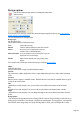
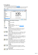
Table Of Contents
- Welcome to Xara 3D Maker 7
- Purchasing and unlocking Xara 3D Maker
- What's New in Xara 3D Maker Version 7
- Other Xara products
- Getting Help
- Working with Xara 3D Maker
- How To ...
- Quick overview
- Open a new document
- Change the text
- Rotate and position the graphic
- Light the graphic
- Color the graphic
- Resize the graphic
- Add bevels & extrude
- Select characters
- Add shadows
- Create animations
- Creating cursor (CUR & ANI) files
- Importing 2D objects
- Apply the style of an existing graphic
- Create buttons, boards, boards + holes and borders
- Create screen savers
- Create Flash files
- Save and export
- Export options for GIF, PNG or BMP files
- Export options for JPG
- Export options for animated cursors (ANI)
- Export options for animated GIFs
- Export options for AVIs (movies and screen savers)
- Export options for screen savers (SCR)
- Export options for Flash bitmap format (SWF) files
- Export options for Flash vector format (SWF) files
- General info on AVI videos
- Exporting transparent title animations for movies
- Customize Xara 3D Maker
- Reference Section
- Legal

Design options
You can also display design options by clicking this button in the
options toolbar.
You can make a text message or shape into an instant design using these options. See Create buttons,
boards, boards + holes and borders
for more information on creating designs.
Design type
(left drop-down list)
Choose from a number of different designs:
Text
Creates the text only.
Button
Creates a button with the text flat on its surface.
Board
Sit your text on a solid board, so the text
extrudes from a solid background.
Board and holes
As if you'd taken a saw to your board, to give an
impression of a cut-out image.
Border
Adds a border around your text, giving it more
impact.
You can also easily switch between these design types using the design toolbar
.
Shape
(right drop-down list)
Lets you choose from a range of predefined button shapes.
Stretch:
This controls the width to height ratio. 100% is equal width and height. Above 100% makes the button
wider.
Corners:
Buttons can have square or rounded corners. With the check box selected (for rounded corners) type in
a value for the corner radius.
Size
(dimmed for text only designs): Lets you resize the text in relation to the button, board or border.
X-Y
(dimmed for text only designs): Lets you move the text in relation to the button, board or border.
Angle
(dimmed for text only designs): Lets you change the angle of the text in relation to the button, board or
border.
Design picker
You can import a design shape from any existing X3D file. This one design can then be used with any of
the design types listed above. One design = four different combinations. For text graphics, you import the
first character as the design shape. So, for the default graphic of X3D, you would import the X as the
Page 143