
User Guide

204 Chapter 14 Customizing the Development Environment
Building a tag editor
Defining a tag editor is requires the following three tasks:
1 Layout the dialog box controls.
2 Specify how to populate the controls with tag attributes.
3 Define the tag generation template.
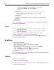
Open the \Extensions\TagDefs\mytag.vtm file to see how these tasks are coded.
Defining controls
The control and container tags represent graphical controls. The tags are nearly
identical in definition, the difference being that only container tags have the
capability to contain
control tags.
A Panel control is a good example of a control that can be a container containing a
control, such as a label or a text box:
<tag>
<editorlayout height=50 width=200>
<container name="Panel1" type="Panel" width=150 height=50>
<control name="lblCode" type="Label" caption="Code" down=20
right=20 width=70/>
<control name="txtCode" type="TextBox" anchor="lblCode"
<corner="NE" width="30"/>
</container>
</editorlayout>
</tag>
You can name the above template mytag.vtm and test it by attempting to edit an
empty
mytag tag.
The example displays a single Panel container containing
Label and TextBox
controls. Only the following controls can be containers:
• TabDialog A tab dialog control capable of containing
TabPage container
controls.
• TabPage Only used inside a
TabDialog container control.
• Panel A general purpose panel container control which can contain any
regular or container controls.
The control represented by a
control or a container tag is defined by the type
attribute; the width and height attributes determine the size.
The anchor and corner attributes determine the point relative to which the control
is positioned. The anchor can be specified as the name of any control that was
already laid down. The corner specifies the corner of the anchor control to be used
for positioning. The possible values are
NE, NW, SE, and SW. The down and right
attributes then specify the pixel offset from the anchor control.