
User Guide

Chapter 398
Setting the chart type and options
You can select different chart types and options, and preview how the data will be presented,
either as you create the chart or afterwards. Options vary according to the chart type.
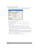
To choose a chart type for a selected chart:
1 In the Tools panel, if the Chart tool is not showing, select it from its pop-up menu.
2 Double-click the Chart tool.
3 In the Chart dialog box, click the Chart Type button to display the chart type options.
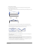
4 Select a chart type:
Grouped Column compares data using bars. Each bar represents one cell of data.
Stacked Column compares the progress of data. Each bar represents a row of data.
Line shows the trend of data over a period of time. Each line represents a column of data.
Pie displays data in a circular graph with wedges. Each cell of data represents a single wedge.
Each row of data produces a Pie chart.
Area displays filled areas representing the progress of data over time. Each area represents a
column of data in the worksheet. Each column’s value is added to the previous column’s total.
Scatter plots data as paired sets of coordinates to identify trends in data. Each coordinate
represents a row of data containing two cells.
5 To preview your chart using the selected chart type, click Apply.