
User Guide

Chapter 4168
• Area displays filled areas representing the progress of data over time. Each area
represents a column of data in the Worksheet. Each column’s value is added to
the previous column’s total.
• Scatter plots data as paired sets of coordinates to identify trends in data. Each
coordinate represents a row of data containing two cells.
4 To preview your chart using the selected chart type, click Apply.
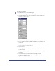
To specify chart options:
1 In the Chart dialog box, click the Chart Type button to display the chart
type options.
2 Select a chart type using the buttons and then select options for that type:
• For Grouped Column and Stacked Column graphs, specify a Column Width
to adjust the space of each column. Values greater than 100 overlap columns.
• For a Grouped Column graph, specify a cluster width to adjust the space for
each group of columns. Values greater than 100 overlap columns.
• For a Pie chart, specify the Separation between pie pieces, from none (0) to 50.
• For Line and Scatter graphs, choose the type of Data Markers: None, Square,
Diamond, Triangle, or Circle.
3 Select Data Numbers in Chart to display the data values next to the graph
or chart points.
This option is not available for Area graphs.
4 Select Drop Shadow to add a drop shadow behind and to the right of the chart.
This option is not available for Line and Scatter charts.
5 Select Legends Across Top to display legends across the top of the chart, instead
of along its side.
6 Click Apply to preview your changes without closing the Chart panel, or click
OK to apply the changes and close the panel.
Adding gridlines to charts
All of the graphs except the Pie chart let you display gridlines along the x- or y-axis.
To add gridlines:
1 Select the chart and double-click the Chart tool.
2 In the Chart Type dialog box, click the chart type button.
3 Choose an Axis Display option to set where the vertical axis of the chart
appears—to the right, to the left, or on both sides of the chart.