
User Guide

Drawing 167
5
When you have finished editing data, click Apply to preview your changes
without closing the Chart panel, or click OK to apply the changes and
close the panel.
To edit the appearance of chart elements:
1 Click the Subselect tool and click a chart element to select it.
2 Choose Edit > Superselect or press Tilde (~) to select all of the elements of
that series.
3 Edit the selection as desired. You can apply most of the same changes and
transformations to the selected elements as you can to any other FreeHand
object, such as coloring, scaling, or rotating.
You can add perspective to the entire chart, but not to individual elements. For
more information, see “Creating perspective” on page 231.
To color selected chart elements:
Choose a stroke or fill color from the pop-up color wells in the Tools panel. You
can also use the Find & Replace Graphics function to change colors in a chart. For
more information, see “Making global changes” on page 191.
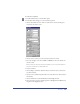
Setting the chart type and options
You can select different chart types and options, and preview how the data will be
presented, either as you create the chart or afterwards. Options vary according to
the chart type.
To choose a chart type for a selected chart:
1 Double-click the Chart button in the Xtra toolbar.
2 In the Chart dialog box, click the Chart Type button to display the chart
type options.
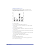
3 Select a chart type:
• Grouped Column compares data using bars. Each bar represents
one cell of data.
• Stacked Column compares the progress of data. Each bar represents
a row of data.
• Line shows the trend of data over a period of time. Each line represents
a column of data.
• Pie displays data in a circular graph with wedges. Each cell of data represents
a single wedge. Each row of data produces a Pie chart.