
User Guide


operate one way on some of the character set, and another
way for the rest or can also use Auto Kerning in
combination with manual kerning. Of course, you can
always manually adjust the results of Auto Kerning as
well. You can even use Auto Kerning as a diagnostic tool
for your font: by running it with different settings and then
exporting the kerning and examining it, you can tell where
the biggest spacing problems occur. Of course, anything
with this many enhancements is going to take some practice
and getting used to before you can learn to use it properly.
But if you are really interested in kerning, it will be
worthwhile.
When you choose the Advanced mode (presumably after
making out your will), a pop-up menu will appear which can
navigate you through four different Auto Kerning screens.
The first of these dialogs is called Which characters, and it
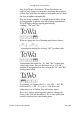
looks something like this:
This dialog lets you tell Fontographer which characters to
Auto Kern. The first option, Open file of pairs allows you
to select a text file of kerning pairs. Once you do that,
Fontographer will do its normal Auto Kerning functions, but
it will only create kerning pairs for the ones specified in that
file. This is good for telling Fontographer exactly what you
want done in the way of kerning.
The Choose letters option allows you to pick ranges of
characters to kern. For instance, under First letter, you
could simply enter “T” in the These characters field, and for
the Second letter field, choose “All characters.” That
would make Fontographer create only kerning pairs
starting with “T.” Or, it could be that you only want
Fontographer to create kerning pairs among the most
commonly used characters (in English, anyway), in which
case you would choose “Upper case, lower case, numbers,
and punctuation.”
The next screen is the How many and how much dialog,
Fontographer User's Manual
5: Metrics: Spacing and Kerning Page #31