
User Guide


characters you set by hand.
In addition, you might not want Fontographer to consider all
the possible combinations of letters in determining optimal
spacing. For instance, you might want to bias the spacing to
favor the uppercase and lowercase letters. By changing the
selection in the Second letter field, you can optimize the
spacing for the character combinations most likely to occur,
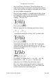
and basically let Fontographer worry more about how “Th”
is spaced instead of how “Tá” is spaced.
The second dialog is the How much dialog, which
determines the tightness or looseness of the spacing, works
just like it does in the Easy mode dialog described earlier in
this chapter.
The third screen is the Technique dialog:
This dialog allows you to customize some of the behavior
of Auto Spacing.
Check Monospace numerals if you want all the numbers
to have the same width.
Check Adjust left sidebearings if you want to let
Fontographer (in its quest to achieve optimum spacing)
move the character around relative to the origin. Some
people are pretty adamant about where their characters sit
relative to the origin, so they want Fontographer to leave
them alone and do spacing solely by adjusting the widths,
which is what happens if this box is left unchecked.
Check Allow negative right sidebearings if you want to
let Fontographer have portions of the character outlines
extend to the right of the width. This will generally allow
tighter spacing, but can in some cases cause certain
characters to touch each other.
The Threshold field contains a value which influences the
grouping of sets of character pairs Fontographer is
considering. Threshold is a numerical value describing the
distance necessary to define a kerning pair. This value is
Fontographer User's Manual
5: Metrics: Spacing and Kerning Page #29