
User Guide

24 Flex Builder Tutorials
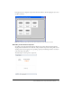
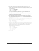
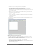
In Design view, the component’s layout should look similar to the following figure if you select
the Panel container:
Note: The component will scale to fit in the space allotted to it in the flexstore.mxml file.
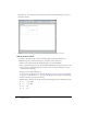
Add the product details
According to the mock-up, the component should display the following information: a
thumbnail image, the product name and price, and a brief product description.
1.
Make sure the component file, ProductDetail.mxml, is open in Flex Builder.
2.
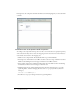
Insert a placeholder image for the product thumbnail by clicking in the upper left corner of the
Canvas container, clicking the Image button in the Controls category of the Insert bar, and
selecting the following image:
fbComponents/mockups/tnImage.png
In the tutorial on data bindings (see “Tutorial: Binding components to data with Flex Builder”
on page 39), you modify the
source property of the Image so that its value is set dynamically
when the user clicks a product in the catalog.
3.
With the Image still selected in the file, change the following properties in the Attributes panel:
■ Size > height: 140
■ Size > width: 150
■ Size > x: 0
■ Size > y: 0