
User Guide

Tutorial: Building custom components with Flex Builder 23
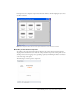
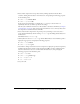
6.
Insert a Canvas container to position the product thumbnail by clicking anywhere inside the
HBox container, clicking the Canvas button on the Insert bar, clearing the default values in the
dialog box that appears, and clicking OK.
Flex Builder inserts an empty Canvas container in the component.
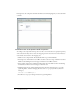
7.
With the Canvas container still selected, specify the values for the following properties in the
Attributes panel:
■ Size > height: 140
■ Size > width: 150
■ Common > clipContent: false
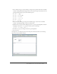
8.
Insert a VBox container for the product name and price by clicking inside the right edge of the
HBox container (without clicking inside the Canvas container), and clicking the VBox button
on the Insert bar.
Flex Builder inserts an empty VBox container in the component.
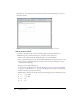
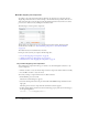
9.
Insert a ControlBar container by clicking inside the Panel container outside and below the
HBox container, and clicking the ControlBar button on the Insert bar.
Flex Builder inserts an empty ControlBar container and automatically positions it at the lower
edge of the Panel container.
10.
With the insertion point still blinking in the ControlBar container, specify the value for the
following property in the Attributes panel:
■ Common > id: ctrl
11.
To make sure the component fits correctly in the Flex Store user interface, select the Panel
container and clear the following properties in the Attributes panel:
■ Size > height:
■ Size > width:
12.
Save the component file in the fbComponents folder by pressing Control+S, double-clicking
the fbComponents folder, and naming the component file as follows:
ProductDetail.mxml