Flex Builder Tutorials This series of four interconnected tutorials explains how you can build a simple Macromedia Flex application using Macromedia Flex Builder. The application is part of a website for the fictitious Flex Store company. The application gives visitors the ability to view a product catalog, find out more about each product, and add products to a shopping cart. The application is a simplified version of the Flex Store application installed with the Flex server.
Install the Flex server on your computer This part of the tutorial describes how to set up the Developer edition of Flex on the same computer as Flex Builder. To compile and run MXML and ActionScript files, you need access to a Flex server. The setup described in this part of the tutorial is only one of many possible configurations. You can also install Flex on a remote server running a different J2EE server and access it through a network or using FTP.
5. On the Install Options dialog box, select the Integrated JRun4/Macromedia Flex option. The dialog box gives you other installation options. This tutorial assumes that you selected the Integrated JRun4/Macromedia Flex option. 6. After you finish installing Flex 1.0, install any Flex updaters available on the Macromedia website at www.macromedia.com/go/flex_updaters. 7. Start the server by selecting Start > All Programs > Macromedia > Macromedia Flex > Start Integrated Flex Server.
For more information, see the Flex installation documentation on the Macromedia website at www.macromedia.com/go/flex_install/. You can verify that the Flex server is running normally as follows: 1. Open the following URL in your browser: http://localhost:8700/samples The Flex Sample Apps page appears. 2. Select a sample application to run it.
3. In the Flex application root folder, locate the folder named products in the \samples\flexstore\assets\ folder and copy it to the \samples\fbBindings\assets\ folder. The products folder contains the product images used in the tutorial.
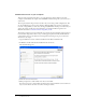
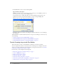
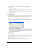
5. In the URL Prefix text box, enter the following URL: http://localhost:8700/samples/ Caution: Flex Builder may auto-populate this text box with http://localhost:8700/flex/. Make sure you change the value to http://localhost:8700/samples/. To get the Flex server to compile files while you work, Flex Builder uploads the file to the application root folder you specified and attempts to request it using the URL prefix. The Flex Server Site Setup dialog box should look like this: 6.
Review the approved user interface mock-ups During the planning and approval stages of the project, members of your team produced final mock-ups of the user interface for the Flex Store. You will use these mock-ups to guide you when you create the MXML layout. The final mock-ups for the Flex Store application are stored in your fbLayout folder: /fbLayout/mockups You can open a mock-up file in your favorite image editor from the Files panel in Flex Builder.
The user will also have the option of viewing thumbnails in the product catalog on the left side of the layout. The second mock-up file, uiThumbs.
4. Set the following property in the Attributes panel of the Tag inspector (Window > Tag Inspector): ■ Styles > verticalGap: 0 Note: The angle bracket means the verticalGap property is located in the Styles category of the Attributes tab. This convention is used throughout the tutorials. 5. Save the file in the fbLayout folder by selecting File > Save, double-clicking the fbLayout folder, and naming the file as follows: flexstore.
1. In Design view, click the Expanded button on the Document toolbar and then click anywhere inside the Application container. Expanded mode adds borders and padding to controls and containers in Design view to help you lay out your application. (The borders and padding appear only at design time.) You can click the Standard button at any time to get a better representation of how your project will look after it’s compiled. 2. In the Containers category of the Insert bar, click the VBox button.
Position the catalog component In this part of the tutorial, you position the product catalog on the left side of the user interface as shown in the mock-ups (see “Review the approved user interface mock-ups” on page 7). To meet this design requirement, you decide to use an HBox (for horizontal box) container to position the two halves of your user interface side by side. 1.
Position the product detail and shopping cart components In this part of the tutorial, you position the product detail and shopping cart components on the right side of the user interface as shown in the mock-ups (see “Review the approved user interface mock-ups” on page 7). You decide to use the existing HBox container to meet this layout requirement. The mock-up also shows the product detail and shopping cart components stacked on top of each other.
7. Click anywhere in the new tag, click the Refresh button on the Attributes tab, and set the following properties in the Attributes tab: bottomCanvas ■ Common > id: ■ Size > height: ■ Size > width: ■ Size > widthFlex: ■ Other > vScrollPolicy: 208 364 1 off 8. Switch back to Design view to inspect your layout. Tip: Press F4 to hide the workspace and maximize the Document window. Press F4 again to restore the workspace. 9. Save your work.
6. Insert the thumbnail view button by clicking inside the HBox container, clicking the Image button in the Controls category of the Insert bar, and selecting the following image file: /fbLayout/assets/images/thumb_off.png 7. Insert the grid view button by clicking inside the HBox container on the right side of the thumbnail view button (without selecting the button), clicking the Image button on the Insert bar, and selecting the following image file: /fbLayout/assets/images/list_off.png 8.
Tutorial: Building custom components with Flex Builder In this tutorial, you learn how to use Flex Builder to create custom components, the building blocks of Flex applications.
Build the grid view component According to the following mock-up, the grid view component should display the Flex Store product catalog as a two-column grid of names and prices. The user can select the grid view by clicking a button at the lower edge of the catalog. The grid view component does not contain any product data in this tutorial. Another tutorial describes how to add data (see “Tutorial: Binding components to data with Flex Builder” on page 39). 1.
4. With the insertion point still blinking in the VBox container, specify the values for the following properties in the Attributes panel: ■ Size > height: Clear the value ■ Size > width: ■ Styles > verticalGap: Clear the value 0 Note: The “Size > height” expression means the height property is located in the Size category of the Attributes tab. This convention is used throughout the tutorials. 5.
9. Switch to Code view (View > Code) and set column properties of the DataGrid by locating the two tags, and adding the following properties (shown in bold type): You can use Code hints to quickly set these properties.
Build the thumbnail view component According to the following mock-up, the thumbnail view component should display the Flex Store product catalog as a set of thumbnails with names and prices. The user can select the thumbnail view by clicking a button at the lower edge of the catalog. The thumbnail view component will not contain any product data in this tutorial. Another tutorial describes how to add data (see “Tutorial: Binding components to data with Flex Builder” on page 39). 1.
4. Insert a Tile container to lay out the products by clicking anywhere in the VBox container, and clicking the Tile button in the Containers category of the Insert bar. Flex Builder inserts a Tile container in the component file. 5. With the insertion point still blinking in the Tile container, specify the values for the following properties in the Attributes panel: ■ Common > id: ■ Size > y: tileView 12 6.
In Design view, the completed component should look similar to the following figure if you select the VBox container: Note: The component will scale to fit in the space allotted to it in the flexstore.mxml file. Build the product detail component According to the component’s functional specification, the product detail component should display product details when a user clicks one of the products in the product catalog.
The product detail component will not contain any data in this tutorial. Another tutorial describes how to add data (see “Tutorial: Binding components to data with Flex Builder” on page 39).
6. Insert a Canvas container to position the product thumbnail by clicking anywhere inside the HBox container, clicking the Canvas button on the Insert bar, clearing the default values in the dialog box that appears, and clicking OK. Flex Builder inserts an empty Canvas container in the component. 7. With the Canvas container still selected, specify the values for the following properties in the Attributes panel: 140 ■ Size > height: ■ Size > width: ■ Common > clipContent: 150 false 8.
In Design view, the component’s layout should look similar to the following figure if you select the Panel container: Note: The component will scale to fit in the space allotted to it in the flexstore.mxml file. Add the product details According to the mock-up, the component should display the following information: a thumbnail image, the product name and price, and a brief product description. 1. Make sure the component file, ProductDetail.mxml, is open in Flex Builder. 2.
4. Insert a Label component for the product name by clicking anywhere inside the VBox container, clicking the Label button on the Insert bar, and specifying the following properties in the Attributes panel: Product Name ■ Common > text: ■ Common > styleName: title In the tutorial on data bindings, you modify the text property so that its value is set dynamically when the user clicks a product in the catalog. The title style is defined in the flexstore.css file attached to the flexstore.
In Design view, the component should look similar to the following figure if you select the Panel container: Finish the footer of the product detail component According to the component mock-up, the footer has a control that lets users specify the quantity of the selected item they want to add to the shopping cart. The footer also has a button that lets users add the selected item to the shopping cart. 1. Make sure the component file, ProductDetail.mxml, is open in Flex Builder. 2.
6. Insert a NumericStepper control by clicking to the right of the Quantity label in the ControlBar container, clicking the NumericStepper button in the Controls category of the Insert bar, and specifying the following properties in the Attributes panel: qty ■ Common > id: ■ Common > maximum: 100 ■ Common > minimum: 1 ■ Common > stepSize: ■ Common > value: ■ Size > width: 1 1 40 7.
Build the shopping cart component According to the component’s functional specification, the shopping cart component should display the products that the user wants to bring to the checkout area for purchase. The user can delete items from the cart by selecting an item and clicking the Delete button. The user can also proceed to the checkout area by clicking the Checkout button. The following is a mock-up of the component: The shopping cart component does not contain any data in this tutorial.
4. Press Enter to accept your change and close the Quick Tag Editor. 5. Insert a ControlBar container by clicking inside the Panel container and clicking the ControlBar button in the Containers category of the Insert bar. Flex Builder inserts an empty ControlBar container and automatically positions it at the lower edge of the Panel container. 6.
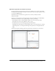
3. Click the Plus (+) button to add a third column, and then set the following options in the DataGrid dialog box: dg ■ ID: ■ Header Text (first row): ■ Header Text (second row): ■ Header Text (third row): Price ■ Column Name (first row): name ■ Column Name (second row): ■ Column Name (third row): Name Qty qty price The DataGrid dialog box should look similar to the following figure: 4. Click OK. Flex Builder inserts a DataGrid component in your component file. 5.
In Design view, the component should look similar to the following figure if you select the Panel container: Note: The component will scale to fit in the space allotted to it in the flexstore.mxml file. Finish the footer of the shopping cart component According to the component mock-up, the footer has one button to let the user delete a selected item in the shopping cart, and another button to let the user proceed to the checkout area.
5. Insert a Label component by clicking to the right of the Checkout button in the ControlBar container, clicking the Label button on the Insert bar, and specifying the values for the following properties in the Attributes panel: Total: $ ■ Common > text: ■ Common > styleName: price 6. Save your work.
1. Open the fbComponents/flexstore.mxml file in Flex Builder. Make sure you open the file located in the fbComponents folder. 2. In Design view, click anywhere inside the ViewStack container in the Product Catalog panel, and select Insert > Local Component. The Insert Local Component dialog box appears: 3. Click the Browse button and select the ThumbnailView component, ThumbnailView.mxml, in the Open dialog box that appears.
Insert the detail and cart components in the layout Two Canvas containers were inserted in the Flex Store layout to position the product detail and shopping cart components. In this part of the tutorial, you insert the two components that you created, ProductDetail.mxml and CartView.mxml, into the Canvas containers. 1. Make sure the flexstore.mxml file is open in Flex Builder. The file is located in the fbComponents folder. 2.
11. Make sure the Flex server is started, and then press F12 to run the flexstore.mxml file in a browser. The file should look similar to the following figure: If the Results panel displays validation errors, carefully retrace the preceding steps. If you get a server error, make sure the testing server is correctly defined in Flex Builder. For more information, see “Define a Flex Builder site” on page 5.
You decide to write an ActionScript function called changeView() that sets the child component of the ViewStack container, which displays when the user clicks one of the buttons. The ViewStack container has two child components: the GridView and the ThumbnailView components that you inserted in it (see “Insert the view components in the Flex Store layout” on page 32). To make your code more readable, you decide to place the ActionScript function in a separate file called flexstore_script.
6. Assign the event handler to the thumbnail view button by clicking anywhere in the first tag in the flexstore.mxml file and setting the following property in the Events panel of the Tag inspector: ■ mouseDown: changeView('thumb') When the user clicks the image, the changeView() function is called. 7. Assign the event handler to the grid view button by clicking anywhere in the second ■ tag and setting the following property in the Events panel: mouseDown: changeView('thumb') 8.
5. Scroll down the Flex Store page and click the grid view button. The click event calls the changeView function in the ActionScript file. Flex Builder does the following: ■ Stops the application’s execution at the breakpoint you set. ■ Switches to Code view and centers on the line with the breakpoint. ■ Displays the Call Stack panel in the Results panel group. 6. Click the Variables tab next to the Call Stack tab and then expand the Locals category.
Tutorial: Binding components to data with Flex Builder This tutorial shows you how to use Flex Builder to visually bind Flex components to data. It also explains how to use the Network Monitor to monitor the data passed between your application and the Flex server. In a real-world situation, the Flex Store application would connect to a backend system to retrieve and display information about the products.
Specify the web service to use The source of the Flex Store product data is a web service that returns an array containing the data. 1. In Flex Builder, open the flexstore.mxml file located in the fbBindings folder (not the fbComponents folder). 2. In the Data panel (Window > Data), click the Plus (+) button, and select Web Service from the pop-up menu. The Add Web Service dialog box appears. 3. Select FlexStoreCatalogWS from the pop-up menu.
6. Expand the tree control in the Data panel to inspect the web service. The catalogWS web service has one method called getList that returns an array. Bind the web service to a data model A Flex data model provides a convenient way to refer to and manipulate data in Flex applications. For the Flex Store, you decide to create a data model and bind it to the product data returned by the web service. 1. Make sure your flexstore.mxml file is open in Flex Builder. 2.
6. In the left pane in the Add Binding - Step 2 dialog box, select the catalogWS web service. The Flex component containing the data you want to pass to the data model is the web service. 7. In the right pane, expand the tree control, and select result. 8. Click Finish to create the binding. The new binding appears in the Bindings panel. 9. Save your work. Send the web service request You must specify an event that sends a request to the web service for the product data.
3. Save the ActionScript file. 4. Switch to the flexstore.mxml file. 5. In Code view, assign the event handler to the application’s initialize event by locating the tag, and adding the following property (shown in bold type):
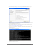
5. Click the final WebServer event (onResult) and inspect the information in the right pane. If the application successfully called the web service when it was initialized, then the data for the product catalog should appear in the right pane. Note how the Network Monitor converts the raw data passed between the server and the application into ActionScript. Scroll down to view the catalog data passed to the application.
6. In Code view, locate the tag and add the following property (shown in bold type): 7. Save the flexstore.mxml file. 8. Make sure the Flex server is running and then press F12 to test the flexstore.mxml file in a browser. If the thumbnail view is showing, switch views by clicking the grid view button at the lower edge of the catalog.
3. Select and delete all the tags in the Tile container. These placeholder images are no longer required. 4. With the insertion point still between the opening and closing tags, enter the following script block: The product data passed by the flexstore.mxml file is stored in the dataObject variable.
Detect the product in the GridView component The first task is to modify the GridView component so it can detect when a user clicks a product. 1. Open the GridView.mxml file located in the fbBindings folder and enter the following tag after the opening tag: [Event("change")] 2.
Retrieve the product selection After detecting the product selected by the user, you must pass the information from the GridView and ThumbnailView components to the main application. If the user hasn’t selected a product yet, you must specify a default selection. 1. Open the flexstore_script.as file located in the fbBindings folder. 2. Enter the following variable declaration at the top of the page: var selectedItem; You want to use this variable to store the product selected by the user.
Display the product detail After detecting and retrieving the product selection, you can retrieve the product’s data and use it in the ProductDetail component. 1. Open the ProductDetail.mxml file located in the fbBindings folder. 2. In Code view, enter the following code after the opening tag to declare an object variable called dataObject: var dataObject:Object; The variable declaration creates a property of the ProductDetail component.
7. With the To option selected, scroll down and select the text property (it should be selected by default). You want the text property to receive the product name data. 8. Specify the source of the data by clicking the Next button, and then selecting the name element of the dataModel data model, as follows: 9. Click Finish to create the binding. 10.
14. Switch to the flexstore.mxml file and in Code view, locate the tag and add the following property (shown in bold type):
Add products to the shopping cart The product detail view (ProductDetail component) must not only display details about a product, it must let the user do the following tasks: • Specify the quantity of the displayed product the user wants to add to the shopping cart • Add the product and quantity to the shopping cart. You modify the ProductDetail component so that it adds the displayed product and quantity to the shopping cart when the user clicks the Add to Cart button. 1. Switch to the ProductDetail.
Display the products in the shopping cart After using the shoppingCart object to add products to the shopping cart, you can retrieve the data and use it in the CartView component. 1. Open the CartView.mxml file located in the fbBindings folder. 2. In Code view, enter the following code after the opening tag: var dataObject:ShoppingCart; The variable declaration creates a property of the CartView component.
9. Press F12 to test the file in a browser. Click any product in the list view or the thumbnail view. The product details should appear in the product detail area. Click the Add to Cart button to add the product to the shopping cart. Choose another product, change the quantity, and click the Add to Cart button again. Activate the Delete button The final step in this tutorial is to active the Delete button in the shopping cart area so the user can remove items from the cart. 1. Switch to the CartView.
This completes the tutorial on Flex data bindings. If you want, you can continue experimenting with Flex Builder and Flex development by adding more features to your Flex Store application. For example, you could add drag-and-drop support to let the user drag a product from the catalog view to the product detail view. Next steps For more samples and tutorials, see the following websites: • Flex Builder pages on the Macromedia website at www.macromedia.
Flex Builder Tutorials