
User Guide

Tutorial: Building custom components with Flex Builder 41
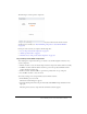
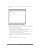
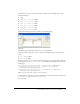
The following is a mock-up of the component:
The product detail component will not contain any data in this tutorial. Another tutorial
describes how to add data (see “Tutorial: Binding components to data with Flex Builder”
on page 58).
In this part of the tutorial, you complete the following tasks:
• “Lay out the product detail component” on page 41
• “Add the product details” on page 43
• “Finish the footer of the product detail component” on page 45
Lay out the product detail component
After studying the component mock-up, you decide to use the following Flex containers to lay
out the component:
• A Panel container to create the header and position the component’s child containers vertically
• An HBox container within the Panel container to position the product thumbnail and the
product information side by side
• A VBox container within the HBox to position the product name on top of the price
• A ControlBar container to create the footer
You start by creating a new component file based on a Panel container.
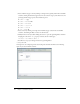
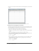
1.
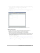
In Flex Builder, press Control+N.
The New Document dialog box appears.
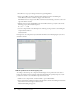
2.
Select Flex Development in the left pane and double-click MXML Component:Panel in the
right pane.
The dialog box closes and a component file with a Panel container appears.