
User Guide

UIScrollBar component 831
Note, however, that with the Halo theme, the width of a vertically oriented scroll bar must be 16
pixels, and the height of a horizontally oriented scroll bar must also be 16 pixels. These
dimensions are determined strictly by the current theme used with the scroll bar. Only the
dimension of a scroll bar that corresponds to its length can be changed.
You can customize the appearance of a UIScrollBar instance by using styles and skins.
Using styles with the UIScrollBar component
The UIScrollBar component supports the following styles:
Using skins with the UIScrollBar component
The UIScrollBar component uses 13 skins for the track, scroll box (thumb), and buttons. To
customize these skin elements, edit the symbols in the Flash UI Components 2/Themes/
MMDefault/ScrollBar Assets/States folder. For more information, see “About skinning
components” on page 80.
Both horizontal and vertical scroll bars use the same vertical skins, and when displaying a
horizontal scroll bar the UIScrollBar component rotates the skins as appropriate.
The UIScrollBar component supports the following skin properties.
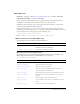
Style Theme Description
themeColor
Halo The base color scheme of a component. Possible values are
"haloGreen", "haloBlue", and "haloOrange". The default value
is
"haloGreen".
scrollTrackColor
Sample The background color for the scroll track.The default value is
0xCCCCCC (light gray).
symbolColor
Sample The color of the up and down scroll arrows. The default value
is 0x000000 (black).
symbolDisabledColor
Sample The color of the up and down scroll arrows in a disabled scroll
bar. The default value is 0x848384 (dark gray).
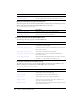
Property Description
upArrowUpName
The up (normal) state of the up and left buttons. The default value is
ScrollUpArrowUp.
upArrowOverName
The rollover state of the up and left buttons. The default value is
ScrollUpArrowOver.
upArrowDownName
The pressed state of the up and left buttons. The default value is
ScrollUpArrowDown.
downArrowUpName
The up (normal) state of the down and right buttons. The default value is
ScrollDownArrowUp.
downArrowOverName
The rollover state of the down and right buttons. The default value is
ScrollDownArrowOver.
downArrowDownName
The pressed state of the down and right buttons. The default value is
ScrollDownArrowDown.