
User Guide

Using styles to customize component color and text 75
You can use class style declarations and color names to easily control the colors of text and
symbols on the screen. For example, if you want to provide a display configuration screen that
looks like Microsoft Windows, you would define color names like ButtonText and WindowText
and class style declarations like Button, CheckBox, and Window.
Note: Some components provide style properties that are an array of colors, such as
alternatingRowColors. You must set these styles only as an array of numeric RGB values, not color
names.
Customizing component animations
Several components, such as the Accordion, ComboBox, and Tree components, provide
animation to demonstrate the transition between component states—for example, when
switching between Accordion children, expanding the ComboBox drop-down list, and expanding
or collapsing Tree folders. Additionally, components provide animation related to the selection
and deselection of an item, such as rows in a list.
You can control aspects of these animations through the following styles:
The mx.transtions.easing package provides six classes to control easing:
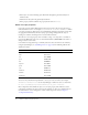
Animation style Description
openDuration
The duration of the transition for open easing in Accordion, ComboBox,
and Tree components, in milliseconds. The default value is 250.
openEasing
A reference to a tweening function that controls the state animation in the
Accordion, ComboBox, and Tree components. The default equation uses
a sine in/out formula.
popupDuration
The duration of the transition as a menu opens in the Menu component, in
milliseconds. The default value is 150. Note, however, that the animation
always uses the default sine in/out equation.
selectionDuration
The duration of the transition in ComboBox, DataGrid, List, and Tree
components from a normal to selected state or back from selected to
normal, in milliseconds. The default value is 200.
selectionEasing
A reference to a tweening function that controls the selection animation in
ComboBox, DataGrid, List, and Tree components. This style applies only
for the transition from a normal to a selected state. The default equation
uses a sine in/out formula.
Easing class Description
Back
Extends beyond the transition range at one or both ends one time to
provide a slight overflow effect.
Bounce
Provides a bouncing effect entirely within the transition range at one or
both ends. The number of bounces is related to the duration: longer
durations produce more bounces.
Elastic
Provides an elastic effect that falls outside the transition range at one or
both ends. The amount of elasticity is unaffected by the duration.