
User Guide

742 Chapter 6: Components Dictionary
TextInput component
The TextInput component is a single-line text component that is a wrapper for the native
ActionScript TextField object. You can use styles to customize the TextInput component; when
an instance is disabled, its contents appear in a color represented by the disabledColor style.
A TextInput component can also be formatted with HTML, or as a password field that disguises
the text.
A TextInput component can be enabled or disabled in an application. In the disabled state, it
doesn’t receive mouse or keyboard input. When enabled, it follows the same focus, selection, and
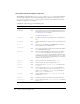
navigation rules as an ActionScript TextField object. When a TextInput instance has focus, you
can also use the following keys to control it:
For more information about controlling focus, see “Creating custom focus navigation”
on page 50 or “FocusManager class” on page 419.
A live preview of each TextInput instance reflects changes made to parameters in the Property
inspector or Component inspector during authoring. Text is not selectable in the live preview,
and you cannot enter text in the component instance on the Stage.
When you add the TextInput component to an application, you can use the Accessibility panel to
make it accessible to screen readers.
Using the TextInput component
You can use a TextInput component wherever you need a single-line text field. If you need a
multiline text field, use the TextArea component. For example, you could use a TextInput
component as a password field in a form. You could also set up a listener that checks if the field
has enough characters when a user tabs out of the field. That listener could display an error
message indicating that the proper number of characters must be entered.
TextInput parameters
You can set the following authoring parameters for each TextInput component instance in the
Property inspector or in the Component inspector:
text specifies the contents of the TextInput component. You cannot enter carriage returns in the
Property inspector or Component inspector. The default value is "" (an empty string).
editable indicates whether the TextInput component is editable (true) or not (false). The
default value is
true.
password indicates whether the field is a password field (true) or not (false). The default value
is
false.
Key Description
Arrow keys Move the insertion point one character left and right.
Shift+Tab Moves focus to the previous object.
Tab Moves focus to the next object.
CHAPTER 6
Components Dictionary