
User Guide

606 Chapter 6: Components Dictionary
A ProgressBar component supports the following styles:
Using skins with the ProgressBar component
The ProgressBar component uses skins to represent the progress bar track, the completed bar, and
an indeterminate bar. To skin the ProgressBar component while authoring, modify symbols in the
Flash UI Components 2/Themes/MMDefault/ProgressBar Elements folder. For more
information, see “About skinning components” on page 80.
The track and bar graphics are each made up of three skins corresponding to the left and right
caps and the middle. The caps are used “as is,” and the middle is resized horizontally to fit the
width of the ProgressBar instance.
The indeterminate bar is used when the ProgressBar instance’s
indeterminate property is set to
true. The skin is resized horizontally to fit the width of the progress bar.
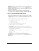
Style Theme Description
themeColor
Halo The base color scheme of a component. Possible values are
"haloGreen", "haloBlue", and "haloOrange". The default value
is
"haloGreen".
color
Both The text color. The default value is 0x0B333C for the Halo
theme and blank for the Sample theme.
disabledColor
Both The color for text when the component is disabled. The default
color is 0x848384 (dark gray).
embedFonts
Both A Boolean value that indicates whether the font specified in
fontFamily is an embedded font. This style must be set to
true if fontFamily refers to an embedded font. Otherwise, the
embedded font will not be used. If this style is set to
true and
fontFamily does not refer to an embedded font, no text will be
displayed. The default value is
false.
fontFamily
Both The font name for text. The default value is "_sans".
fontSize
Both The point size for the font. The default value is 10.
fontStyle
Both The font style: either "normal" or "italic". The default value
is
"normal".
fontWeight
Both The font weight: either "none" or "bold". The default value
is
"none". All components can also accept the value "normal"
in place of "none" during a setStyle() call, but subsequent
calls to
getStyle() will return "none".
textDecoration
Both The text decoration: either "none" or "underline". The default
value is
"none".
barColor
Sample The foreground color in denoting the percent complete. The
default color is white. To set the bar color on a Halo-themed
component, set the
themeColor style property.
trackColor
Sample The background color for the bar. The default value is
0x666666 (dark gray).