
User Guide

576 Chapter 6: Components Dictionary
This code creates a listener object, listen, that uses the event object, evt, to catch menu
item selections.
Note: You must call the addEventListener() method to register the listener with the menu
instance, not with the menu bar instance.
7.
Select Control > Test Movie to test the MenuBar component.
Customizing the MenuBar component (Flash Professional only)
This component sizes itself according to the activator labels that are supplied through the
dataProvider property or the methods of the MenuBar class. When an activator button is in a
menu bar, it remains at a fixed size that is dependent on the font styles and the text length.
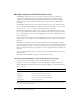
Using styles with the MenuBar component
The MenuBar component creates an activator label for each menu in a group. You can use styles
to change the look of the activator labels. A MenuBar component supports the following styles:
The MenuBar component also forwards all style settings for Menu style properties to the
composed Menu instances. For a list of Menu style properties, see “Using styles with the Menu
component” on page 548.
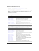
Style Theme Description
themeColor
Halo The base color scheme of a component. Possible values are
"haloGreen", "haloBlue", and "haloOrange". The default value
is
"haloGreen".
color
Both The text color. The default value is 0x0B333C for the Halo
theme and blank for the Sample theme.
disabledColor
Both The color for text when the component is disabled. The default
color is 0x848384 (dark gray).
embedFonts
Both A Boolean value that indicates whether the font specified in
fontFamily is an embedded font. This style must be set to
true if fontFamily refers to an embedded font. Otherwise, the
embedded font will not be used. If this style is set to
true and
fontFamily does not refer to an embedded font, no text will be
displayed. The default value is
false.
fontFamily
Both The font name for text. The default value is "_sans".
fontSize
Both The point size for the font. The default value is 10.
fontStyle
Both The font style: either "normal" or "italic". The default value
is
"normal".
fontWeight
Both The font weight: either "none" or "bold". The default value
is
"none". All components can also accept the value "normal"
in place of "none" during a setStyle() call, but subsequent
calls to
getStyle() will return "none".
textDecoration
Both The text decoration: either "none" or "underline". The default
value is
"none".