
User Guide


Setting component parameters 47
Alternatively, you can import the class package, as in this example:
import mx.controls.CheckBox;
createClassObject(CheckBox, "cb", 5, {label:"Check Me"});
For more information, see UIObject.createClassObject() on page 810 and Chapter 4,
“Handling Component Events,” on page 55.
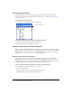
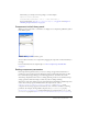
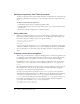
Components in the Library panel
When you add a component to a document, it is displayed as a compiled clip (SWC file) symbol
in the Library panel.
A ComboBox component in the Library panel
You can add more instances of a component by dragging the component icon from the library to
the Stage.
For more information about compiled clips, see “About compiled clips and SWC files”
on page 17.
Setting component parameters
Each component has parameters that you can set to change its appearance and behavior. A
parameter is a property that appears in the Property inspector and Component inspector. The
most commonly used properties appear as authoring parameters; others must be set with
ActionScript. All parameters that can be set during authoring can also be set with ActionScript.
Setting a parameter with ActionScript overrides any value set during authoring.
All version 2 components inherit properties and methods from the UIObject and UIComponent
classes; these are the properties and methods that all components use, such as
UIObject.setSize(), UIObject.setStyle(), UIObject.x, and UIObject.y. Each
component also has unique properties and methods, some of which are available as authoring
parameters. For example, the ProgressBar component has a
percentComplete property
(
ProgressBar.percentComplete), and the NumericStepper component has nextValue and
previousValue properties (NumericStepper.nextValue, NumericStepper.previousValue).