
User Guide

List component 453
4.
Select Frame 1 of the Timeline and, in the Actions panel, enter the following:
myList.dataProvider = myDP;
If you have defined a data provider named myDP, the list will fill with data. (For more
information about data providers, see
List.dataProvider.)
5.
Select Control > Test Movie to see the list with its items.
Customizing the List component
You can transform a List component horizontally and vertically while authoring and at runtime.
While authoring, select the component on the Stage and use the Free Transform tool or any of the
Modify > Transform commands. At runtime, use the
List.setSize() method (see
UIObject.setSize()).
When a list is resized, the rows of the list shrink horizontally, clipping any text within them.
Vertically, the list adds or removes rows as needed. Scroll bars position themselves automatically.
For more information about scroll bars, see “ScrollPane component” on page 668.
Using styles with the List component
You can set style properties to change the appearance of a List component.
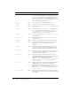
A List component uses the following styles:
Style Theme Description
themeColor
Halo The base color scheme of a component. Possible values are
"haloGreen", "haloBlue", and "haloOrange". The default
value is
"haloGreen".
alternatingRowColors
Both Specifies colors for rows in an alternating pattern. The value
can be an array of two or more colors, for example,
0xFF00FF, 0xCC6699, and 0x996699. Unlike single-
value color styles,
alternatingRowColors does not accept
color names; the values must be numeric color codes. By
default, this style is not set and
backgroundColor is used in
its place for all rows.
backgroundColor
Both The background color of the list. The default color is white
and is defined on the class style declaration. This style is
ignored if
alternatingRowColors is specified.
backgroundDisabledColor
Both The background color when the component’s enabled
property is set to "
false". The default value is 0xDDDDDD
(medium gray).
border styles
Both The List component uses a RectBorder instance as its
border and responds to the styles defined on that class. See
“RectBorder class” on page 647.
The default border style is "
inset".
color
Both The text color.
disabledColor
Both The color for text when the component is disabled. The
default color is 0x848384 (dark gray).