
User Guide

370 Chapter 6: Components Dictionary
The DateField component uses four categories of text to display the month name, the days of the
week, today’s date, and regular dates. The text style properties set on the DateField component
itself control the regular date text and the text displayed in the collapsed state, and provide
defaults for the other text. To set text styles for specific categories of text, use the following class-
level style declarations.
The following example demonstrates how to set the month name and days of the week to a deep
red color.
_global.styles.HeaderDateText.setStyle("color", 0x660000);
_global.styles.WeekDayStyle.setStyle("color", 0x660000);
Using skins with the DateField component
The DateField component uses skins to represent the visual states of the pop-up icon, a
RectBorder instance for the border around the text input, and a DateChooser instance for the
pop-up. To skin the pop-up icon while authoring, modify skin symbols in the Flash UI
Components 2/Themes/MMDefault/DateField Assets/States folder in the library of one of the
themes FLA files. For more information, see “About skinning components” on page 80. For
information about skinning the RectBorder and DateChooser instances, see “RectBorder class”
on page 647 and “Using skins with the DateChooser component” on page 353.
Besides the skins used by the subcomponents mentioned above, a DateField component uses the
following skin properties to dynamically skin the pop-up icon:
To create movie clip symbols for DateField skins:
1.
Create a new FLA file.
2.
Select File > Import > Open External Library, and select the HaloTheme.fla file.
This file is located in the application-level configuration folder. For the exact location on your
operating system, see “About themes” on page 77.
3.
In the theme’s Library panel, expand the Flash UI Components 2/Themes/MMDefault folder
and drag the DateField Assets folder to the library for your document.
4.
Expand the DateField Assets folder in the library of your document.
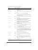
Declaration name Description
HeaderDateText
The month name.
WeekDayStyle
The days of the week.
TodayStyle
Today’s date.
Property Description
openDateUp
The up state of the pop-up icon.
openDateDown
The down state of the pop-up icon.
openDateOver
The over state of the pop-up icon.
openDateDisabled
The disabled state of the pop-up icon.