
User Guide

252 Chapter 6: Components Dictionary
Using styles with the DataGrid component
You can set style properties to change the appearance of a DataGrid component. The DataGrid
component inherits styles from the List component. (See “Using styles with the List component”
on page 453.) The DataGrid component also supports the following styles:
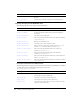
Style Theme Description
backgroundColor
Both The background color, which can be set for the whole grid or
for each column.
backgroundDisabledColor
Both The background color when the component’s enabled
property is set to
"false". The default value is 0xDDDDDD
(medium gray).
border styles
Both The DataGrid component uses a RectBorder instance as its
border and responds to the styles defined on that class. See
“RectBorder class” on page 647.
The default border style value is
"inset".
headerColor
Both The color of the column headers. The default value is
0xEAEAEA (light gray)
headerStyle
Both A CSS style declaration for the column header that can be
applied to a grid or column to customize the header styles.
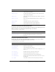
color
Both The text color. The default value is 0x0B333C for the Halo
theme and blank for the Sample theme.
disabledColor
Both The color for text when the component is disabled. The
default color is 0x848384 (dark gray).
embedFonts
Both A Boolean value that indicates whether the font specified in
fontFamily is an embedded font. This style must be set to
true if fontFamily refers to an embedded font. Otherwise,
the embedded font will not be used. If this style is set to
true
and
fontFamily does not refer to an embedded font, no text
will be displayed. The default value is
false.
fontFamily
Both The font name for text. The default value is "_sans".
fontSize
Both The point size for the font. The default value is 10.
fontStyle
Both The font style: either "normal" or "italic". The default value
is
"normal".
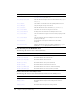
fontWeight
Both The font weight: either "none" or "bold". The default value
is
"none". All components can also accept the value
"normal" in place of "none" during a setStyle() call, but
subsequent calls to
getStyle() will return "none".
textAlign
Both The text alignment: either "left", "right", or "center". The
default value is
"left".
textDecoration
Both The text decoration: either "none" or "underline". The
default value is
"none".
vGridLines
Both A Boolean value that indicates whether to show vertical grid
lines (
true) or not (false). The default value is true.