
User Guide

160 Chapter 6: Components Dictionary
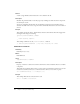
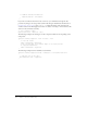
Using skins with the CheckBox component
The CheckBox component uses symbols in the library to represent the button states. To skin the
CheckBox component while authoring, modify symbols in the Library panel. The CheckBox
component skins are located in the Flash UI Components 2/Themes/MMDefault/CheckBox
Assets/states folder in the library of either the HaloTheme.fla file or the SampleTheme.fla file. For
more information, see “About skinning components” on page 80.
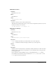
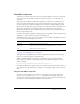
A CheckBox component uses the following skin properties:
Each of these skins corresponds to the icon indicating the CheckBox state. The CheckBox
component does not have a border or background.
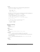
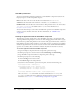
To create movie clip symbols for CheckBox skins:
1.
Create a new FLA file.
2.
Select File > Import > Open External Library, and select the HaloTheme.fla file.
This file is located in the application-level configuration folder. For the exact location on your
operating system, see “About themes” on page 77.
textDecoration
Both The text decoration: either "none" or "underline". The
default value is
"none".
symbolBackgroundColor
Sample The background color of the check box. The default
value is 0xFFFFFF (white).
symbolBackgroundDisabledColor
Sample The background color of the check box when
disabled. The default value is 0xEFEEEF (light gray).
symbolBackgroundPressedColor
Sample The background color of the check box when pressed.
The default value is 0xFFFFFF (white).
symbolColor
Sample The color of the check mark. The default value is
0x000000 (black).
symbolDisabledColor
Sample The color of the disabled check mark. The default
value is 0x848384 (dark gray).
Property Description
falseUpSkin
The up (normal) unchecked state. The default is CheckFalseUp.
falseDownSkin
The pressed unchecked state. The default is CheckFalseDown.
falseOverSkin
The over unchecked state. The default is CheckFalseOver.
falseDisabledSkin
The disabled unchecked state. The default is CheckFalseDisabled.
trueUpSkin
The toggled checked state. The default is CheckTrueUp.
trueDownSkin
The pressed checked state. The default is CheckTrueDown.
trueOverSkin
The over checked state. The default is CheckTrueOver.
trueDisabledSkin
The disabled checked state. The default is CheckTrueDisabled.
Style Theme Description