
User Guide

134 Chapter 6: Components Dictionary
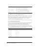
Using skins with the Button component
The Button component includes 32 different skins that can be customized to correspond to the
border and icon in 16 different states. To skin the Button component while authoring, create new
movie clip symbols with the desired graphics and set the symbol linkage identifiers using
ActionScript. (See “Using ActionScript to draw Button skins” on page 136.)
The default implementation of the Button skins provided with both the Halo and Sample themes
uses the ActionScript drawing API to draw the button states, and uses a single movie clip symbol
associated with one ActionScript class to provide all skins for the Button component.
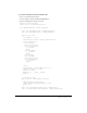
The Button component has many skins because a button has so many states, and a border and
icon for each state. The state of a Button instance is controlled by four properties and user
interaction. The properties that affect skins include the following:
embedFonts
Both A Boolean value that indicates whether the font specified in
fontFamily is an embedded font. This style must be set to
true if fontFamily refers to an embedded font. Otherwise, the
embedded font will not be used. If this style is set to
true and
fontFamily does not refer to an embedded font, no text will be
displayed. The default value is
false.
fontFamily
Both The font name for text. The default value is "_sans".
fontSize
Both The point size for the font. The default value is 10.
fontStyle
Both The font style: either "normal" or "italic". The default value
is
"normal".
fontWeight
Both The font weight: either "none" or "bold". The default value
is
"none". All components can also accept the value "normal"
in place of "none" during a setStyle() call, but subsequent
calls to
getStyle() will return "none".
textDecoration
Both The text decoration: either "none" or "underline". The default
value is
"none".
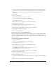
Property Description
emphasized
Provides two different looks for Button instances and is typically used
to highlight one button, such as the default button in a form.
enabled
Shows whether or not the button is allowing user interaction.
toggle
Toggle buttons provide a selected and unselected value and use
different skins to demonstate the current value. For a Button instance
whose
toggle property is set to false, the false skins are used. When
the
toggle property is true, the skin depends on the selected property.
selected
When the toggle property is set to true, this property determines if the
Button is selected (
true or false). Different skins are used to identify
the value and by default are the only way this value is depicted on
screen.
Style Theme Description