
User Guide

118 Chapter 6: Components Dictionary
The following example demonstrates how to set the title of an Alert component to be italicized:
import mx.controls.Alert;
import mx.styles.CSSStyleDeclaration;
var titleStyles = new CSSStyleDeclaration();
titleStyles.setStyle("fontWeight", "bold");
titleStyles.setStyle("fontStyle", "italic");
Alert.titleStyleDeclaration = titleStyles;
Alert.show("Name is a required field", "Validation Error");
The default title style declarations set fontWeight to "bold". When you override the
titleStyleDeclaration property, this default is also overridden, so you must explicitly set
fontWeight to "bold" if that setting is desired.
Note: Text styles set on an Alert component provide default text styles to its components through
style inheritance. For more information, see “Setting inheriting styles on a container” on page 71.
Using skins with the Alert component
The Alert component extends the Window component and uses its title background skin for the
title background, a RectBorder class instance for its border, and Button skins for the visual states
of its buttons. To skin the buttons and title bar while authoring, modify the Flash UI
Components 2/Themes/MMDefault/Window Assets/Elements/TitleBackground and Flash UI
Components 2/Themes/MMDefault/Button Assets/ButtonSkin symbols. For more information,
see “About skinning components” on page 80. The border and background are provided by the
RectBorder class by default. For information on skinning the RectBorder class, see “RectBorder
class” on page 647.
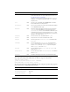
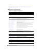
An Alert component uses the following skin properties to dynamically skin the buttons and
title bar:
To set the title of an Alert component to a custom movie clip symbol:
1.
Create a new FLA file.
2.
Create a new symbol by selecting Insert > New Symbol.
3.
Set the name to TitleBackground.
Property Description Default value
buttonUp
The up state of the buttons.
ButtonSkin
buttonUpEmphasized
The up state of the default button.
ButtonSkin
buttonDown
The pressed state of the buttons.
ButtonSkin
buttonDownEmphasized
The pressed state of the default button.
ButtonSkin
buttonOver
The rolled-over state of the buttons.
ButtonSkin
buttonOverEmphasized
The rolled-over state of the default button.
ButtonSkin
titleBackground
The window title bar.
TitleBackground