
User Guide

Using styles to customize component color and text 93
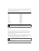
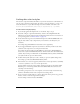
Color names are strings that map to commonly used colors. You can add new color names by
using the Style Manager (see StyleManager class in the Components Language Reference). The
following table lists the default color names:
You can use any valid ActionScript identifier to create your own color names (for example,
"WindowText" or "ButtonText"). Use the Style Manager to define new colors, as shown
here:
mx.styles.StyleManager.registerColorName("special_blue", 0x0066ff);
Most components cannot handle an object as a color style property value. However, certain
components can handle color objects that represent gradients or other color combinations.
For more information, see the “Using styles” section of each component’s entry in the
Components Language Reference.
You can use class style declarations and color names to easily control the colors of text and
symbols on the screen. For example, if you want to provide a display configuration screen that
looks like Microsoft Windows, you would define color names like
ButtonText and
WindowText and class style declarations like Button, CheckBox, and Window.
Color name Value
black 0x000000
white 0xFFFFFF
red 0xFF0000
green 0x00FF00
blue 0x0000FF
magenta 0xFF00FF
yellow 0xFFFF00
cyan 0x00FFFF
haloGreen 0x80FF4D
haloBlue 0x2BF5F5
haloOrange 0xFFC200
NOTE
If the color name is not defined, the component may not draw correctly.
NOTE
Some components provide style properties that are an array of colors, such as
alternatingRowColors. You must set these styles only as an array of numeric RGB
values, not color names.