
User Guide

Using styles to customize component color and text 85
You can also access the styles directly as properties (for example, myButton.color =
0xFF00FF
).
Style properties set on a component instance through
setStyle() have the highest priority
and override all other style settings based on style declaration or theme. However, the more
properties you set using
setStyle() on a single component instance, the slower the
component will render at runtime. You can speed the rendering of a customized component
with ActionScript that defines the style properties during the creation of the component
instance using
UIObject.createClassObject() in the Components Language Reference, and
placing the style settings in the
initObject parameter. For example, with a ComboBox
component in the current document library, the following code creates a combo box instance
named my_cb, and sets the text in the combo box to italic and aligned right:
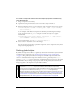
createClassObject(mx.controls.ComboBox, "my_cb", 1, {fontStyle:"italic",
textAlign:"right"});
my_cb.addItem({data:1, label:"One"});
To set or change a property for a single component instance that uses the Halo
theme:
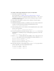
1. Select the component instance on the Stage.
2. In the Property inspector, give it the instance name myComponent.
3. Open the Actions panel and select Scene 1, then select Layer 1: Frame 1.
4. Enter the following code to change the instance to orange:
myComponent.setStyle("themeColor", "haloOrange");
5. Select Control > Test Movie to view the changes.
For a list of styles supported by a particular component, see the component’s entry in the
Components Language Reference.
NOTE
If you want to change multiple properties, or change properties for multiple component
instances, you can create a custom style. A component instance that uses a custom style
for multiple properties will render faster than a component instance with several
setStyle() calls. For more information, see “Setting custom styles for groups of
components” on page 87.