
User Guide

122 Customizing Components
When you edit a component skin symbol:
■ All instances of that component will use new skins (but not custom styles unless you
explicitly attach the styles to the instances), and some components dependent on that
component will use the new skins.
■ If you assign a new theme after you’ve edited your component skins, make sure you don’t
overwrite the existing “edited” skins (a dialog box asks if you want to overwrite the skins
and gives you an opportunity to stop Flash from overwriting the skins).
In this section, you will continue to use the combo box from the previous section (see
“Changing the combo box theme” on page 120). The following steps change the appearance
of the down arrow that opens the combo box menu from an arrow to a circle.
To edit the combo box down arrow symbol:
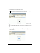
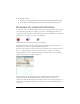
1. In your document’s library, open the ComboBox assets to see the movie clips that are the
skins for the button that opens and closes the combo box instance at runtime. Specifically,
open the Themes > MMDefault > ComboBox Assets > States folder in your document’s
library.
The States folder contains four movie clips: ComboDownArrowDisabled,
ComboDownArrowDown, ComboDownArrowOver, and ComboDownArrowUp. All
four of these symbols are made up of other symbols. And all four use the same symbol for
the down arrow (triangle), called SymDownArrow.
2. Double-click the ComboDownArrowDown symbol to edit it.
You may need to zoom in, up to 800%, to see the details for the button.