
User Guide

120 Customizing Components
Assigning style definitions to the combo box
At this point, you have a style declaration containing a variety of styles, but you need to
explicitly assign the style name to the component instance. You can assign this new style
declaration to any component instance within your document in the following manner. Add
the following line after the
addItem() statements for my_cb (as a coding convention, you
should keep all your combo box construction statements together):
my_cb.setStyle("styleName", "myStyle");
The ActionScript code attached to the first frame of the main Timeline should be as follows:
import mx.styles.CSSStyleDeclaration;
var new_style:Object = new CSSStyleDeclaration();
_global.styles.myStyle = new_style;
new_style.setStyle("textAlign", "right");
new_style.setStyle("selectionColor", "white");
new_style.setStyle("useRollOver", false);
// borderStyle from RectBorder class
new_style.setStyle("borderStyle", "none");
my_cb.addItem({data:1, label:"One"});
my_cb.addItem({data:2, label:"Two"});
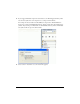
my_cb.setStyle("styleName", "myStyle");
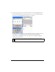
Select Control > Test Movie to see the styled combo box:
Changing the combo box theme
Every user interface component lists the style properties you can set for that component (for
example, all the style properties you can set for a ComboBox component are listed in
“Customizing the ComboBox component” in the Components Language Reference). Within
the table of style properties, a column titled “Theme” shows which installed theme supports
each style property. Not all the style properties are supported by all the installed themes. The
default theme for all user interface components is the Halo theme. When you change the
theme to the Sample theme, you can use a different set of style properties (some properties
may no longer be available if they are listed as Halo only).