
User Guide

Customizing the Button component 99
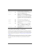
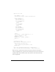
function size():Void
{
var c:Number; // color
var borderStyle:String = getStyle("borderStyle");
switch (borderStyle) {
case "falseup":
case "falserollover":
case "falsedisabled":
c = 0x7777FF;
break;
case "falsedown":
c = 0x77FF77;
break;
case "trueup":
case "truedown":
case "truerollover":
case "truedisabled":
c = 0xFF7777;
break;
}
clear();
var thickness = _parent.emphasized ? 2 : 0;
lineStyle(thickness, 0, 100);
beginFill(c, 100);
drawRect(0, 0, __width, __height);
endFill();
}
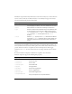
// Required for skins.
static function classConstruct():Boolean
{
UIObjectExtensions.Extensions();
_global.skinRegistry["ButtonSkin"] = true;
return true;
}
static var classConstructed:Boolean = classConstruct();
static var UIObjectExtensionsDependency = UIObjectExtensions;
}
This class creates a square box based on the border style: a blue box for the false up,
rollover, and disabled states; a green box for the normal pressed state; and a red box for the
expanded child. It draws a hairline border in the normal case and a thick border if the
button is emphasized.