
User Guide

98 Button component
In addition to the icon skins, the Button component also supports a standard icon property.
The difference between the standard property and style property is that through the style
property you can set icons for the individual states, whereas with the standard property only
one icon can be set and it applies to all states. If a Button instance has both the
icon property
and icon style properties set, the instance may not behave as anticipated.
To see an interactive demo showing when each skin is used, see Using Components Help.
Using ActionScript to draw Button skins
The default skins in both the Halo and Sample themes use the same skin element for all states
and draw the actual graphics through ActionScript. The Halo implementation uses an
extension of the RectBorder class and some custom drawing code to draw the states. The
Sample implementation uses the same skin and the same ActionScript class as the Halo
theme, with different properties set in ActionScript to alter the appearance of the Button.
To create an ActionScript class to use as the skin and provide different states, the skin can read
the
borderStyle style property of the skin and emphasized property of the parent to
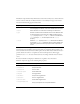
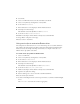
determine the state. The following table shows the border style that is set for each skin:
To create an ActionScript customized Button skin:
1. Create a new ActionScript class file.
For this example, name the file RedGreenBlueSkin.as.
2. Copy the following ActionScript to the file:
import mx.skins.RectBorder;
import mx.core.ext.UIObjectExtensions;
class RedGreenBlueSkin extends RectBorder
{
static var symbolName:String = "RedGreenBlueSkin";
static var symbolOwner:Object = RedGreenBlueSkin;
Property Border style
falseUpSkin falseup
falseDownSkin falsedown
falseOverSkin falserollover
falseDisabled falsedisabled
trueUpSkin trueup
trueDownSkin truedown
trueOverSkin truerollover
trueDisabledSkin truedisabled