
User Guide
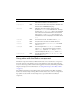

96 Button component
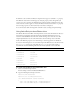
The Button component has many skins because a button has so many states, and a border and
icon for each state. The state of a Button instance is controlled by four properties and user
interaction. The following properties affect skins:
If a button is enabled, it displays its Over state when the pointer moves over it. The button
receives input focus and displays its Down state when it’s pressed. The button returns to its
Over state when the mouse is released. If the pointer moves off the button while the mouse is
pressed, the button returns to its original state and it retains input focus. If the toggle
parameter is set to
true, the state of the button does not change until the mouse is released
over it.
If a button is disabled, it displays its disabled state, regardless of user interaction.
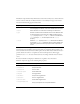
A Button component supports the following skin properties:
Property Description
emphasized
Provides two different looks for Button instances and is typically
used to highlight one button, such as the default button in a form.
enabled
Shows whether or not the button is allowing user interaction.
toggle
Provides a selected and unselected value and uses different skins
to demonstrate the current value. For a Button instance whose
toggle property is set to false, the false skins are used. When the
toggle property is true, the skin depends on the selected
property.
selected
When the toggle property is set to true, determines if the Button
is selected (
true or false). Different skins are used to identify the
value and, by default, are the only way this value is depicted on
screen.
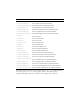
Property Description
falseUpSkin
The up (normal) state.
falseDownSkin
The pressed state.
falseOverSkin
The over state.
falseDisabledSkin
The disabled state.
trueUpSkin
The toggled state.
trueDownSkin
The pressed-toggled state.
trueOverSkin
The over-toggled state.
trueDisabledSkin
The disabled-toggled state.
falseUpSkinEmphasized
The up (normal) state of an emphasized button.