
User Guide

Customizing the Button component 95
Using skins with the Button component
The Button component includes 32 different skins that can be customized to correspond to
the border and icon in 16 different states. To skin the Button component while authoring,
create new movie clip symbols with the desired graphics and set the symbol linkage identifiers
using ActionScript. (For more information, see “Using ActionScript to draw Button skins”
on page 98.)
The default implementation of the Button skins provided with both the Halo and Sample
themes uses the ActionScript drawing API to draw the button states, and uses a single movie
clip symbol associated with one ActionScript class to provide all skins for the Button
component.
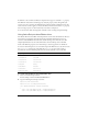
color
Both The text color. The default value is 0x0B333C for the
Halo theme and blank for the Sample theme.
disabledColor
Both The color for text when the component is disabled. The
default color is 0x848384 (dark gray).
embedFonts
Both A Boolean value that indicates whether the font
specified in
fontFamily is an embedded font. This style
must be set to
true if fontFamily refers to an embedded
font. Otherwise, the embedded font is not used. If this
style is set to
true and fontFamily does not refer to an
embedded font, no text is displayed. The default value is
false.
fontFamily
Both The font name for text. The default value is "_sans".
fontSize
Both The point size for the font. The default value is 10.
fontStyle
Both The font style: either "normal" or "italic". The default
value is
"normal".
fontWeight
Both The font weight: either "none" or "bold". The default
value is
"none". All components can also accept the
value
"normal" in place of "none" during a setStyle()
call, but subsequent calls to
getStyle() return "none".
textDecoration
Both The text decoration: either "none" or "underline". The
default value is
"none".
Style Theme Description