
User Guide

Using the Button component 91
enabled is a Boolean value that indicates whether the component can receive focus and input.
The default value is
true.
visible is a Boolean value that indicates whether the object is visible (true) or not (false).
The default value is
true.
You can write ActionScript to control these and additional options for the Button component
using its properties, methods, and events. For more information, see “Button class”
on page 101.
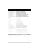
Creating an application with the Button component
The following procedure explains how to add a Button component to an application while
authoring. In this example, the button displays a message when you click it.
To create an application with the Button component:
1. Drag a Button component from the Components panel to the Stage.
2. In the Property inspector, do the following:
■ Enter the instance name my_button.
■ Enter Click me for the label parameter.
■ Enter BtnIcon for the icon parameter.
To use an icon, there must be a movie clip or graphic symbol in the library with a
linkage identifier to use as the icon parameter. In this example, the linkage identifier
is BtnIcon.
■ Set the toggle property to true.
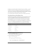
3. Select Frame 1 in the Timeline, open the Actions panel, and enter the following code:
function clicked(){
trace("You clicked the button!");
}
my_button.addEventListener("click", clicked);
The last line of code calls a clicked event handler function for the “click” event. This uses
the method “EventDispatcher.addEventListener()” on page 501 with a custom function
to handle the event.
NOTE
The minHeight and minWidth properties are used by internal sizing routines. They are
defined in UIObject, and are overridden by different components as needed. These
properties can be used if you make a custom layout manager for your application.
Otherwise, setting these properties in the Component inspector will have no visible
effect.