
User Guide

Customizing the Menu component (Flash Professional only) 897
Customizing the Menu component (Flash
Professional only)
The menu sizes itself horizontally to fit its widest text. You can also call the setSize()
method to size the component. Icons should be sized to a maximum of 16 by 16 pixels.
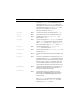
Using styles with the Menu component
You can call the setStyle() method to change the style of the menu, its items, and its
submenus.The Menu component supports the following styles:
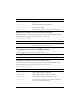
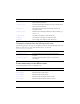
Style n Description
themeColor
Halo The base color scheme of a component. Possible
values are
"haloGreen", "haloBlue", and "haloOrange".
The default value is
"haloGreen".
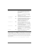
alternatingRowColors
Both Specifies colors for rows in an alternating pattern.
The value can be an array of two or more colors, for
example, 0xFF00FF, 0xCC6699, and 0x996699.
Unlike single-value color styles,
alternatingRowColors does not accept color names;
the values must be numeric color codes. By default,
this style is not set, and
backgroundColor is used in its
place for all rows.
backgroundColor
Both The background color of the menu. The default color
is white and is defined on the class style declaration.
This style is ignored if
alternatingRowColors is
specified.
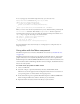
backgroundDisabledColor
Both The background color when the component’s enabled
property is set to “
false”. The default value is
0xDDDDDD (medium gray).
borderStyle
Both The Menu component uses a RectBorder instance as
its border and responds to the styles defined on that
class. See “RectBorder class” on page 1063.
The default border style is
"menuBorder".
color
Both The text color.
disabledColor
Both The color for text when the component is disabled.
The default color is 0x848384 (dark gray).