
User Guide

Customizing the List component 767
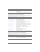
A List component uses the following styles:
Style Theme Description
themeColor
Halo The base color scheme of a component. Possible
values are
"haloGreen", "haloBlue", and "haloOrange".
The default value is
"haloGreen".
alternatingRowColors
Both Specifies colors for rows in an alternating pattern.
The value can be an array of two or more colors, for
example, 0xFF00FF, 0xCC6699, and 0x996699.
Unlike single-value color styles,
alternatingRowColors does not accept color names;
the values must be numeric color codes. By default,
this style is not set and
backgroundColor is used in its
place for all rows.
backgroundColor
Both The background color of the list. The default color is
white and is defined on the class style declaration.
This style is ignored if
alternatingRowColors is
specified.
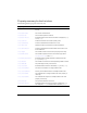
backgroundDisabledColor
Both The background color when the component’s enabled
property is set to "
false". The default value is
0xDDDDDD (medium gray).
borderStyle
Both The List component uses a RectBorder instance as
its border and responds to the styles defined on that
class. See “RectBorder class” on page 1063.
The default border style is "
inset".
color
Both The text color.
disabledColor
Both The color for text when the component is disabled.
The default color is 0x848384 (dark gray).
embedFonts
Both A Boolean value that indicates whether the font
specified in
fontFamily is an embedded font. This
style must be set to
true if fontFamily refers to an
embedded font. Otherwise, the embedded font is not
used. If this style is set to
true and fontFamily does
not refer to an embedded font, no text is displayed.
The default value is
false.
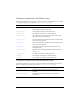
fontFamily
Both The font name for text. The default value is "_sans".
fontSize
Both The point size for the font. The default value is 10.
fontStyle
Both The font style: either "normal" or "italic". The
default value is
"normal".