
User Guide


Customizing the Alert component (Flash Professional only) 69
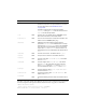
To set the text styles for one category individually, the Alert component provides static
properties that are references to a CSSStyleDeclaration instance.
The following example demonstrates how to set the title of an Alert component to be
italicized:
import mx.controls.Alert;
import mx.styles.CSSStyleDeclaration;
var titleStyles = new CSSStyleDeclaration();
titleStyles.setStyle("fontWeight", "bold");
titleStyles.setStyle("fontStyle", "italic");
Alert.titleStyleDeclaration = titleStyles;
Alert.show("Name is a required field", "Validation Error");
The default title style declarations set fontWeight to "bold". When you override the
titleStyleDeclaration property, this default is also overridden, so you must explicitly set
fontWeight to "bold" if that setting is desired.
Using skins with the Alert component
The Alert component extends the Window component and uses its title background skin for
the title background, a RectBorder class instance for its border, and Button skins for the visual
states of its buttons. To skin the buttons and title bar while authoring, modify the Flash UI
Components 2/Themes/MMDefault/Window Assets/Elements/TitleBackground and Flash
UI Components 2/Themes/MMDefault/Button Assets/ButtonSkin symbols. For more
information, see “About skinning components” in Using Components. The border and
background are provided by the RectBorder class by default. For information on skinning the
RectBorder class, see “RectBorder class” on page 1063.
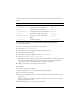
Static property Text affected
buttonStyleDeclaration
Button
messageStyleDeclaration
Message
titleStyleDeclaration
Title
NOTE
Text styles set on an Alert component provide default text styles to its components
through style inheritance. For more information, see “Setting inheriting styles on a
container” in Using Components.