
User Guide


68 Alert component (Flash Professional only)
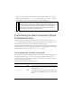
The Alert component includes three different categories of text. Setting the text properties for
the Alert component itself provides default values for all three categories, as shown here:
import mx.controls.Alert;
_global.styles.Alert.setStyle("color", 0x000099);
Alert.show("This is a test alert", "Title");
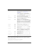
borderStyle
Both The Alert component uses a RectBorder instance as its
border and responds to the styles defined on that class.
For more information, see “RectBorder class”
on page 1063.
The Alert component has a component-specific
borderStyle setting of “alert” with the Halo theme and
“
outset” with the Sample theme.
color
Both The text color. The default value is 0x0B333C for the
Halo theme and blank for the Sample theme.
disabledColor
Both The color for text when the component is disabled. The
default color is 0x848384 (dark gray).
embedFonts
Both A Boolean value that indicates whether the font
specified in
fontFamily is an embedded font. This style
must be set to
true if fontFamily refers to an embedded
font. Otherwise, the embedded font is not used. If this
style is set to
true and fontFamily does not refer to an
embedded font, no text is displayed. The default value is
false.
fontFamily
Both The font name for text. The default value is "_sans".
fontSize
Both The point size for the font. The default value is 10.
fontStyle
Both The font style: either "normal" or "italic". The default
value is
"normal".
fontWeight
Both The font weight: either "none" or "bold". The default
value is
"none". All components can also accept the
value
"normal" in place of "none" during a setStyle()
call, but subsequent calls to
getStyle() return "none".
textAlign
Both The text alignment: either "left", "right", or "center".
The default value is
"left".
textDecoration
Both The text decoration: either "none" or "underline". The
default value is
"none".
textIndent
Both A number indicating the text indent. The default value is
0.
Style Theme Description