
User Guide

Customizing the Alert component (Flash Professional only) 67
This code creates an Alert window with OK and Cancel buttons. When the user clicks
either button, Flash calls the
myClickHandler function. The myClickHandler function
instructs Flash to trace “start stock app” when you click the OK button.
3. Select Control > Test Movie.
Customizing the Alert component (Flash
Professional only)
The Alert component positions itself in the center of the component that was passed as its
parent parameter. The parent must be a UIComponent object. If it is a movie clip, you can
register the clip as mx.core.View so that it inherits from UIComponent.
The Alert window automatically stretches horizontally to fit the message text or any buttons
that are displayed. If you want to display large amounts of text, include line breaks in the text.
The Alert component does not respond to the
setSize() method.
Using styles with the Alert component
You can set style properties to change the appearance of an Alert component. If the name of a
style property ends in “Color”, it is a color style property and behaves differently than
noncolor style properties. For more information, see “Using styles to customize component
color and text” in Using Components.
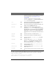
An Alert component supports the following styles:
NOTE
The Alert.show() method includes an optional parameter that displays an icon in the
Alert window (in this example, an icon with the linkage identifier “stockIcon”). To
include this icon in your test example, create a symbol named stockIcon and set it to
Export for ActionScript in the Linkage Properties dialog box or the Create New
Symbol dialog box. The graphics for the stockIcon symbol should be aligned to
coordinates (0,0) in the symbol’s coordinate system.
Style Theme Description
themeColor
Halo The base color scheme of a component. Possible values
are
"haloGreen", "haloBlue", and "haloOrange". The
default value is
"haloGreen".
backgroundColor
Both The background color. The default color is white for the
Halo theme and 0xEFEBEF (light gray) for the Sample
theme.