
User Guide


Customizing the DateField component (Flash Professional only) 437
The DateField component uses four categories of text to display the month name, the days of
the week, today’s date, and regular dates. The text style properties set on the DateField
component itself control the regular date text and the text displayed in the collapsed state, and
provide defaults for the other text. To set text styles for specific categories of text, use the
following class-level style declarations.
The following example demonstrates how to set the month name and days of the week to a
deep red color.
_global.styles.HeaderDateText.setStyle("color", 0x660000);
_global.styles.WeekDayStyle.setStyle("color", 0x660000);
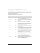
embedFonts
Both A Boolean value that indicates whether the font
specified in
fontFamily is an embedded font. This style
must be set to
true if fontFamily refers to an embedded
font. Otherwise, the embedded font is not used. If this
style is set to
true and fontFamily does not refer to an
embedded font, no text is displayed. The default value
is
false.
fontFamily
Both The font name for text. The default value is "_sans".
fontSize
Both The point size for the font. The default value is 10.
fontStyle
Both The font style: either "normal" or "italic". The default
value is
"normal".
fontWeight
Both The font weight: either "none" or "bold". The default
value is
"none". All components can also accept the
value
"normal" in place of "none" during a setStyle()
call, but subsequent calls to
getStyle() return "none".
textDecoration
Both The text decoration: either "none" or "underline". The
default value is
"none".
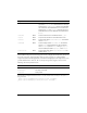
Declaration name Description
HeaderDateText
The month name.
WeekDayStyle
The days of the week.
TodayStyle
Today’s date.
Style Theme Description