
User Guide

436 DateField component (Flash Professional only)
Using styles with the DateField component
You can set style properties to change the appearance of a date field instance. If the name of a
style property ends in “Color”, it is a color style property and behaves differently than
noncolor style properties. For more information, see “Using styles to customize component
color and text” in Using Components.
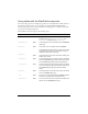
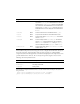
The DateField component supports the following styles:
Style Theme Description
themeColor
Halo The glow color for the rollover and selected dates.
Possible values are
"haloGreen", "haloBlue", and
"haloOrange". The default value is "haloGreen"
backgroundColor
Both The background color. The default value is 0xEFEBEF
(light gray).
borderColor
Both The border color. The default value is 0x919999.
The DateField component’s drop-down list uses a solid
single-pixel line as its border. This border cannot be
modified through styles or skinning.
headerColor
Both The background color for the drop-down heading. The
default color is white.
rollOverColor
Both The background color of a rolled-over date. The default
value is 0xE3FFD6 (bright green) with the Halo theme
and 0xAAAAAA (light gray) with the Sample theme.
selectionColor
Both The background color of the selected date. The default
value is a 0xCDFFC1 (light green) with the Halo theme
and 0xEEEEEE (very light gray) with the Sample
theme.
todayColor
Both The background color for the today’s date. The default
value is 0x666666 (dark gray).
color
Both The text color. The default value is 0x0B333C with the
Halo theme and blank with the Sample theme.
disabledColor
Both The color for text when the component is disabled. The
default color is 0x848384 (dark gray).