
User Guide


416 DateChooser component (Flash Professional only)
Only the month scrolling buttons can be dynamically skinned in this component. A
DateChooser component uses the following skin properties:
The button symbols are used exactly as is, without applying colors or resizing. The size is
determined by the symbol during authoring.
To create movie clip symbols for DateChooser skins:
1. Create a new FLA file.
2. Select File > Import > Open External Library and then select the HaloTheme.fla file.
This file is located in the application-level configuration folder. For the exact location on
your operating system, see “About themes” in Using Components.
3. In the theme’s Library panel, expand the Flash UI Components 2/Themes/MMDefault
folder and drag the DateChooser Assets folder to the library for your document.
4. Expand the DateChooser Assets/States folder in the library of your document.
5. Open the symbols that you want to customize for editing.
For example, open the backMonthDown symbol.
6. Customize the symbol as desired.
For example, change the tint of the arrow to red.
7. Repeat steps 5-6 for all symbols that you want to customize.
For example, change the tint of the forward arrow down symbol to match the back arrow.
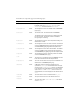
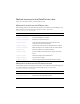
Property Description
backMonthButtonUpSymbolName
The month back button up state. The default value is
backMonthUp.
backMonthButtonDownSymbolName
The month back button pressed state. The default
value is
backMonthDown.
backMonthButtonDisabledSymbolName
The month back button disabled state. The default
value is
backMonthDisabled.
fwdMonthButtonUpSymbolName
The month forward button up state. The default value
is
fwdMonthUp.
fwdMonthButtonDownSymbolName
The month forward button pressed state. The default
value is
fwdMonthDown.
fwdMonthButtonDisabledSymbolName
The month forward button disabled state. The default
value is
fwdMonthDisabled.