
User Guide


Customizing the DateChooser component (Flash Professional only) 415
The DateChooser component uses four categories of text to display the month name, the days
of the week, today’s date, and regular dates. The text style properties set on the DateChooser
component itself control the regular date text and provide defaults for the other text. To set
text styles for specific categories of text, use the following class-level style declarations.
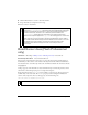
The following example demonstrates how to set the month name and days of the week to a
deep red color.
_global.styles.HeaderDateText.setStyle("color", 0x660000);
_global.styles.WeekDayStyle.setStyle("color", 0x660000);
Using skins with the DateChooser component
The DateChooser component uses skins to represent the forward and back month buttons
and the today indicator. To skin the DateChooser component while authoring, modify skin
symbols in the Flash UI Components 2/Themes/MMDefault/DateChooser Assets/States
folder in the library of one of the themes’ FLA files. For more information, see “About
skinning components” in Using Components.
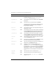
fontWeight
Both The font weight: either "none" or "bold". The default
value is
"none". All components can also accept the
value
"normal" in place of "none" during a setStyle()
call, but subsequent calls to
getStyle() returns "none".
textDecoration
Both The text decoration: either "none" or "underline". The
default value is
"none".
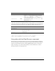
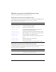
Declaration name Description
HeaderDateText
The month name.
WeekDayStyle
The days of the week.
TodayStyle
Today’s date.
Style Theme Description